What do Pharrell Williams, Kylie Jenner and Beyonce have in common? All three have been sued over a website that’s not accessible.
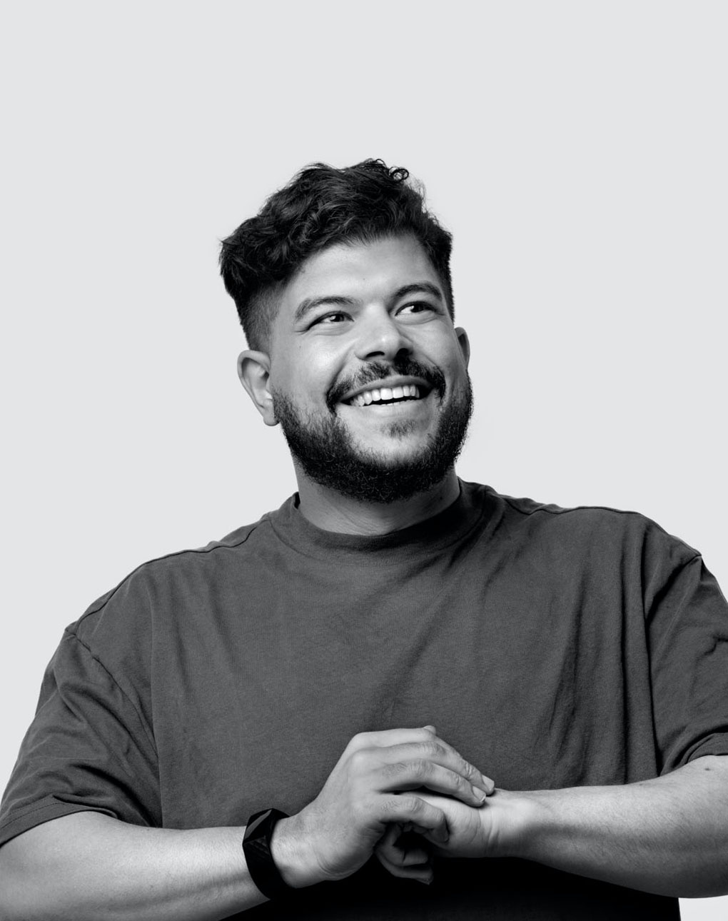
It’s the icebreaker Hatem Agina, UX Designer at Verve, uses in his Verve Academy lecture to draw the whole Verve team in. The Verve Academy is a team-wide course and lecture series hosted by people from Verve or on invite. This first edition was all about how to make accessibility sexy again.
Worldwide, there are one billion people with a disability. 285 million of these people are visually impaired. If you don’t focus on accessible websites, you miss out on a lot of potential customers. Accessibility is about showing solidarity and equalizing each other. If you aim to be inclusive in your brand, you should not forget about digital accessibility. This means equal access to online education, healthcare, employment, e-commerce, friendship, and the list could go on.
Hatem Agina
"It’s not about the numbers, not about empathy, rather it’s about showing solidarity and equalising each other."
.png)
Accessibility on three levels
To recognise those with a disability, the government created accessibility guidelines. The Web Content Accessibility Guidelines states three levels of accessibility: a, aa, aaa. To give you an indication, government websites are ideally a triple A website. The more a’s the more inclusive and accessible it is to the user. However, that often equals boring websites. But why? Hatem argues that we can make accessible websites, without compromising on aesthetics.
Navigating with gray
You know what colors are on a traffic light. Yet, if you had to solely judge based on color you wouldn’t know what to do. For someone who is visually impaired, red and green are just some random shades of gray. So why do we rely on color indicators if a worded label would be even better?
The same goes for coloured backgrounds, buttons, or any other element with copy on it. Use a tool like Stark to check if the contrast is great enough or to see your website design from someone with a visual impairment’s point of view. Don’t want to use a tool? Google: contrast checker, to check if your website performs right on accessibility.
From mouse to keyboard
Don’t have a mouse? Visually or physically disabled? Big chance you’re using the Tab key on the keyboard to navigate through websites. It’s the perfect replacement for a mouse. While navigating, a screen reader converts what’s on the screen. Frequent users can process what this reader says at 90% speed. Of course, you can slow it down too.
Reading an image
Just like Netflix added more descriptive subtitles when important tunes are being played, alt text for images function the same way. When you’re navigating with the Tab key, the computer will read the alt text for you. If this text is image52793, the user won’t know what is there to see. With copy like The famous Eiffel Tower from above, the user gets a better understanding of the content.
.png)
Finding solutions for complexity
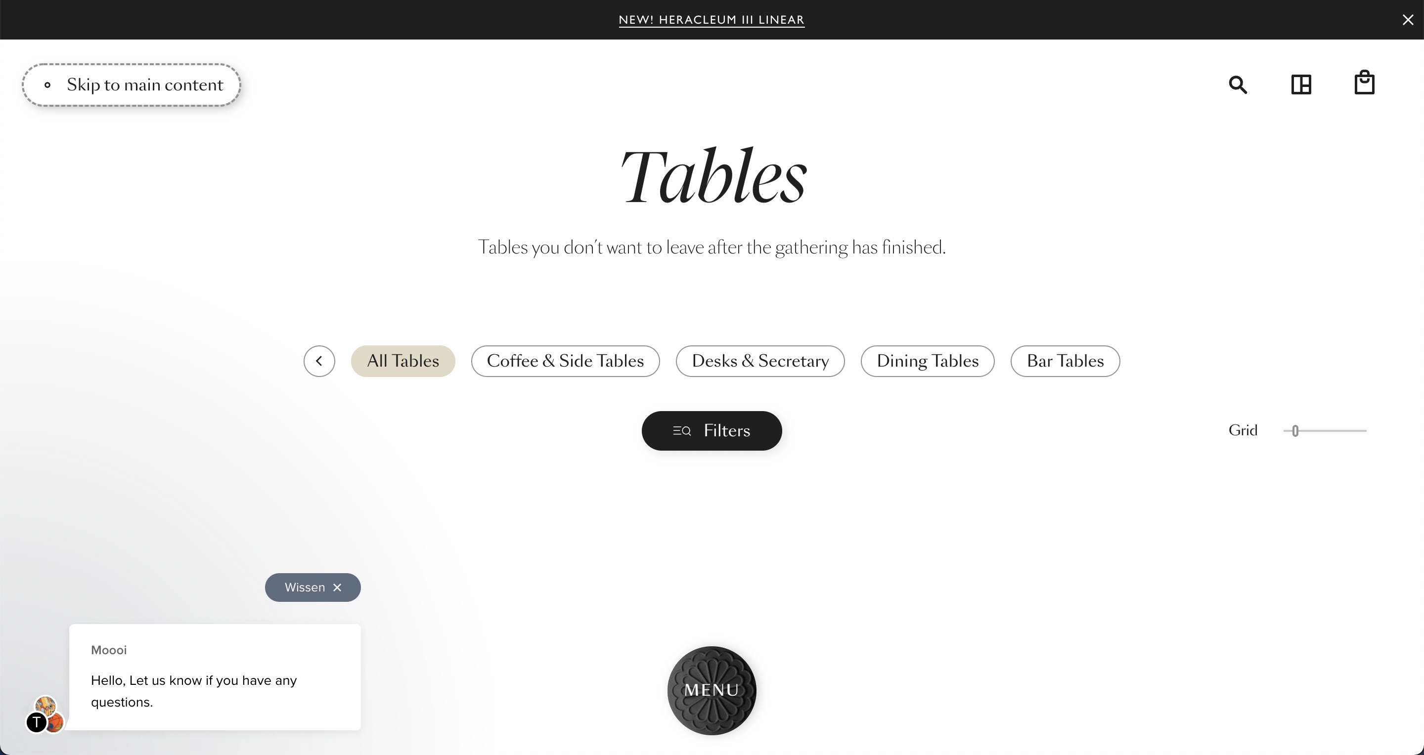
Accessibility is more than just color, navigation and images, but these small changes can make a huge difference for someone with a disability. If we don't compromise on aesthetics too, we can make accessibility sexy again. A great example of fancy, accessible websites are moooi.com and Flos. Moooi's searching by voice function is both incredibly helpful and beautifully designed.
In line with the 101 Design Rules as set-up by Brian Collins, Hatem believes that point one "Design is hope made visible" and point eight "Find a way to connect every project to something much bigger, if your efforts start to lag or feel mundane, return to that larger ideal that inspired you in the first place." are incredibly relevant when designing an accessibile website.