Miro
How Verve rebranded Miro from a niche tool to a global collaboration platform
RealtimeBoard was a popular online collaboration tool looking to scale up under its new name, Miro. The growing team needed a visual identity to reflect their new focus on providing a revolutionary platform for the people and brands setting the international creative agenda. Our new brand identity for Miro won two European Design Awards.
Defining a category
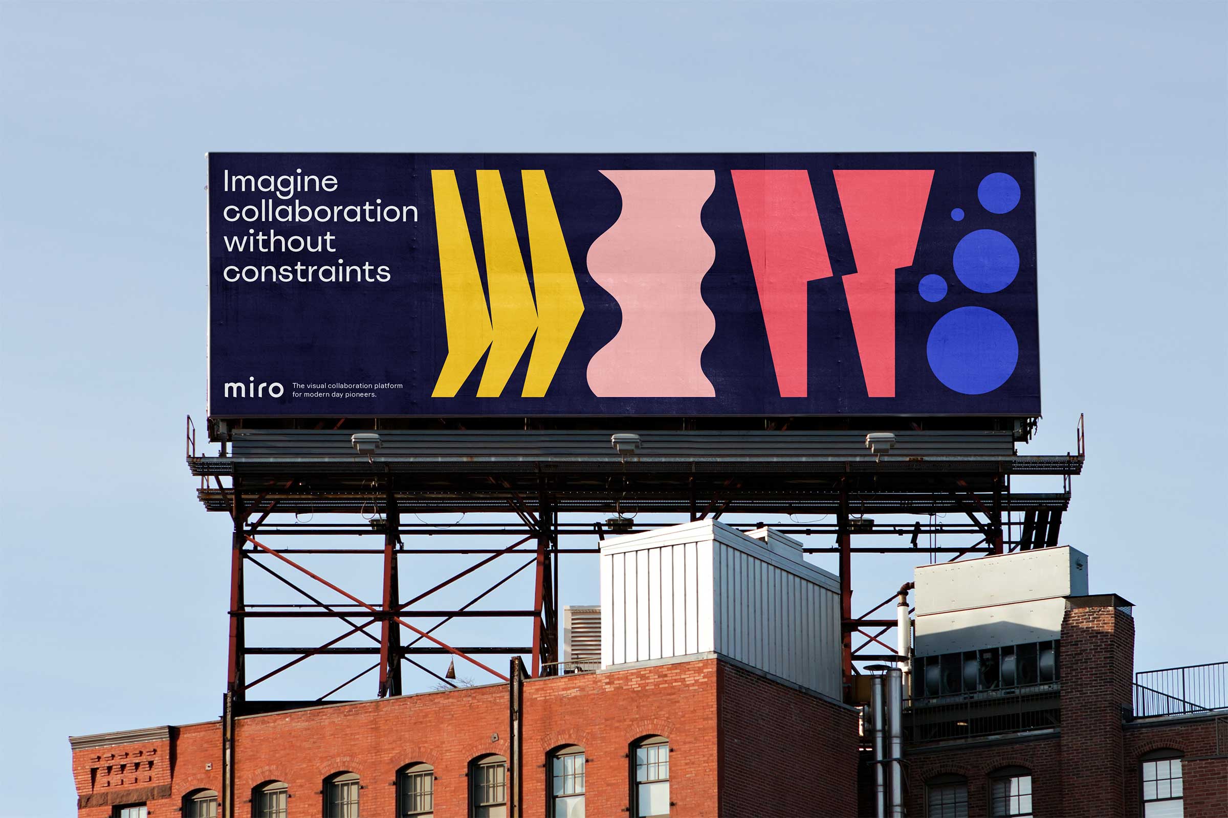
Miro is more than a product. It is one of the first brands to truly define the category of collaboration platforms. From the start, we set out to build an iconic brand with distinctive brand assets. Bold, playful, instantly recognisable. Miro shows that in SaaS, the brand can be as vivid as the product.
Product as brand
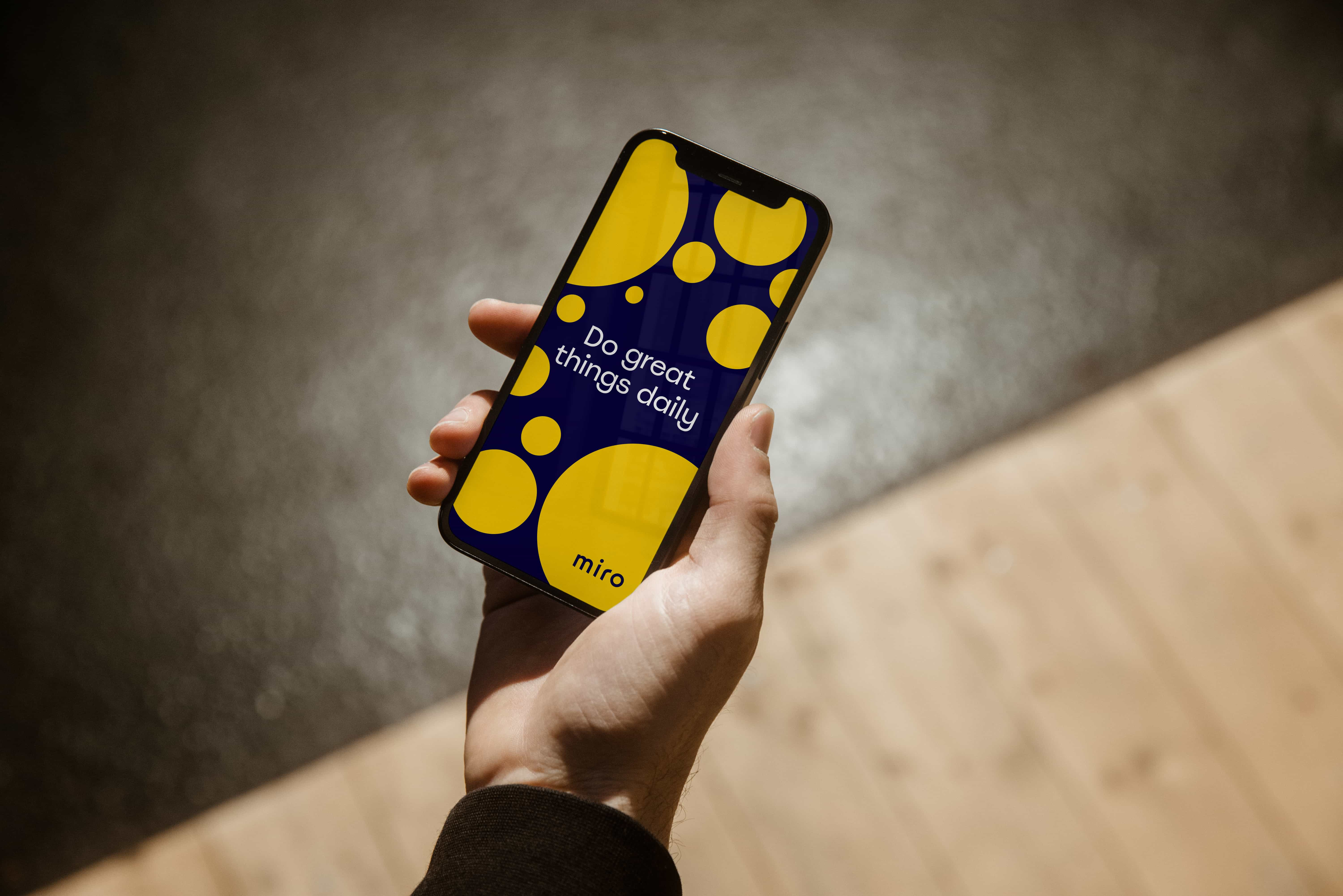
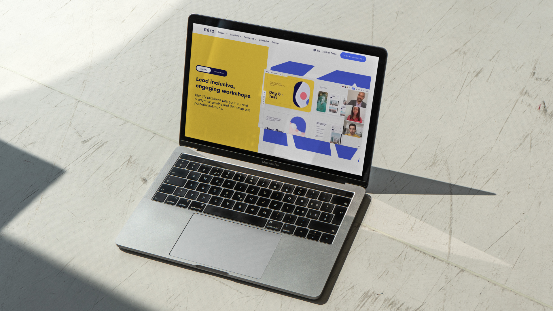
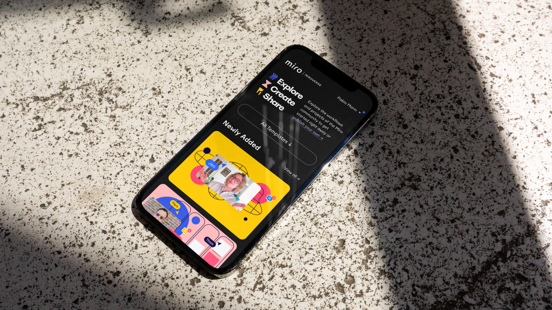
The first interaction with Miro is the product itself. The brand lives through playful interactions, vibrant colours and energetic typography. Every element of the visual identity, the tone of voice, and the dynamic UI come together to form a brand promise of creativity, clarity and collaboration.
A PLG strategy built on emotion
Miro’s product-led growth strategy makes emotional connection essential. The brand wins fans at the level of the individual user and turns them into advocates who pull Miro into the world’s top 100 enterprises. It is a loop: users become fans of the brand, and the brand is carried forward by its fans.
A metaphor for collaboration
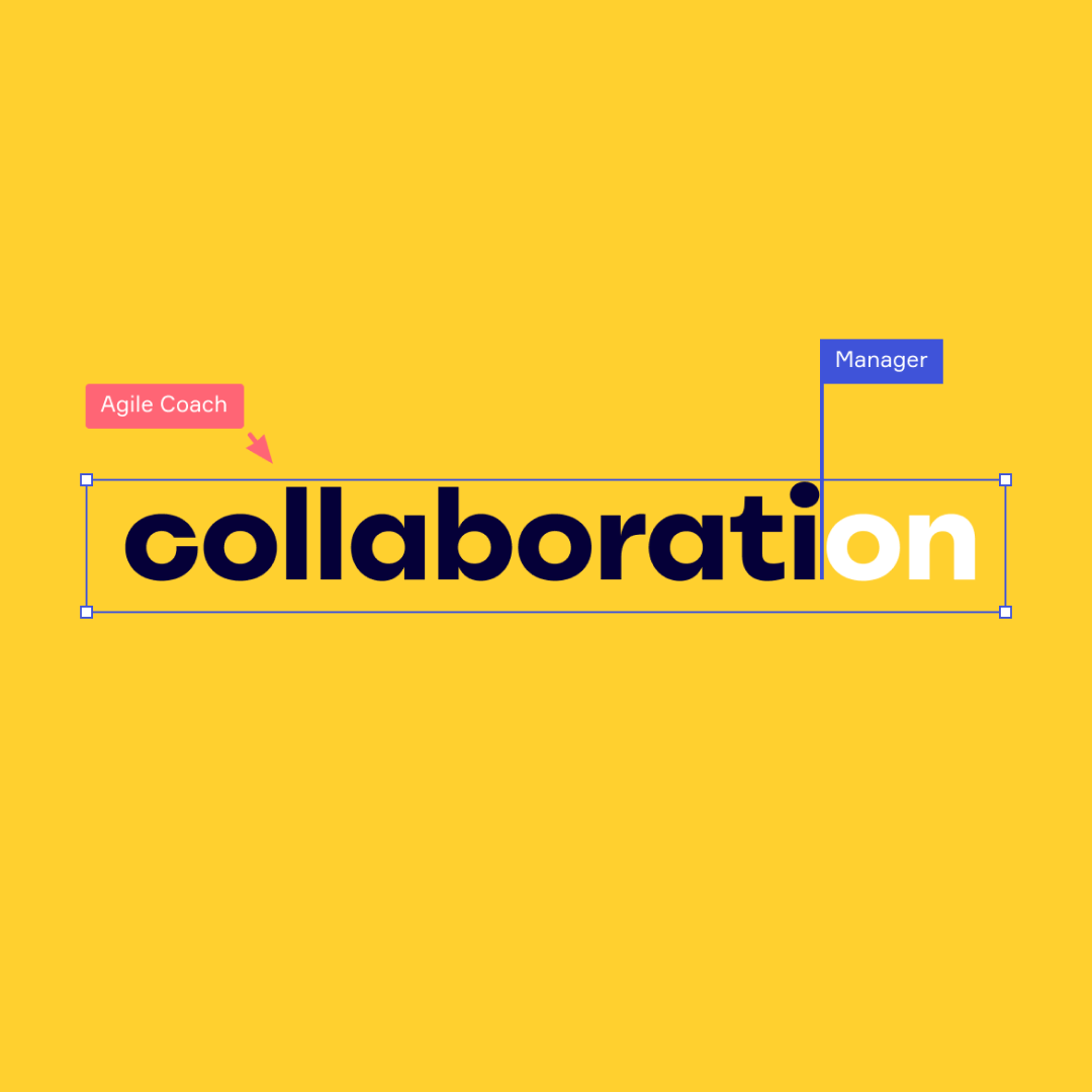
The vibrant, dynamic brand language is a metaphor for disciplines working together and finding the “aha moment” of truly understanding one another. By positioning the brand boldly and unapologetically as a counterpart to corporate sameness, Miro becomes irreplaceable and instantly recognisable.
Miro-ception
The design process itself happened on Miro. Our teams in Amsterdam and San Francisco collaborated in real-time on Miro boards, designing and iterating together. It was a living proof of the platform’s power. We continue to stay involved with the in-house design team, making sure the brand evolves with the same energy, distinctiveness, and strategic clarity that made it iconic.
Result
Miro grew from 2.5 million to 100+ million users following the rebrand. The new identity won two European Design Awards and became the visual foundation for one of the world’s most recognized SaaS brands.
Barbra Gago, Chief Marketing Officer at Miro
“The collaborative approach by Verve gave us confidence that we could achieve great results. We developed a true partnership. I was impressed with the teams speed, agility and vision.”


Verve is a leading brand strategy and brand identity agency based in Amsterdam, the Netherlands. We work with fintech, SaaS, and B2B tech companies like Miro. We brand for irreplaceability: the state where replacing you feels unthinkable. Building a brand to compete across markets? Reach out