We built a visual system around our new positioning as a studio that brands for irreplaceability. Verve’s refreshed identity takes hand-painted watercolors, refined with bespoke digital brushes, and applies AI-driven motion processes. Let three of Verve’s finest tell you how it all worked out.
Walewijn de Boer
Creative Director
At the start of our own agency refresh process, we needed to find a visual style that truly embodied our new positioning. One that could show how Verve captures the irreplaceable essence of brands.
The earliest moodboards we started to collate were filled with soft, blurry, emotional visuals. Stepping back, it was a collection of images that felt like a brand’s aura coming into focus, but never entirely sharp. That sense of something intangible taking form started to inform our creative direction. We wanted to visualize that moment before clarity. That feeling of something powerful and distinct coming to life.
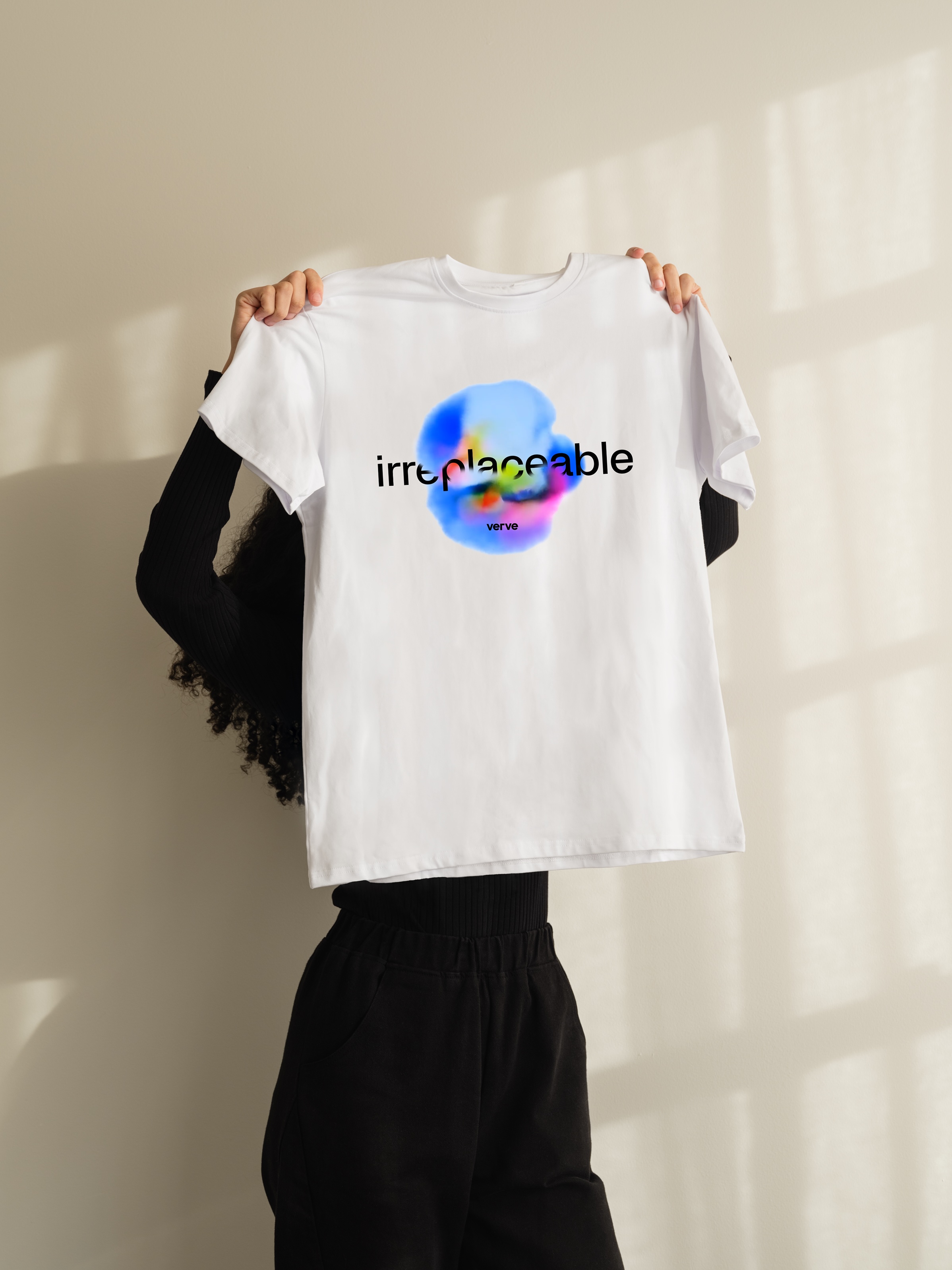
Then one day, our ECD Rindor walked into the studio with a set of watercolor sketches he’d been experimenting with. They were beautiful: loose, textural, and deeply human. We realized instantly that this was the key. The analogue, the handmade, the imperfect. That was how we’d express irreplaceability.
We created a library of these watercolor shapes, and began exploring how they could move. Using AI video generators, we morphed and blended them into each other, discovering unexpected flows and transitions. By tweaking the prompts, adjusting layers, and playing with rhythm, we found what we started calling “brand auras”. abstract, living forms that felt emotional and alive.
Through this process, part human craft and part machine collaboration, we developed a motion system built on intuition and iteration, balancing analogue input with AI-powered transformation.
What makes it special is not the technology itself, but how it connects the human and the digital. The outcome feels instinctive, yet intelligent. Imperfect, yet consistent. It’s what makes the new Verve identity so fitting: a brand system that behaves like us. It’s curious, adaptive, and always in motion.
Sarah de Jager
Digital Design Lead
I co-created our new Brand Aura identity, but let’s talk about the website. It’s the part of the rebrand that a lot people will experience first. And I refused to let become “just another” agency portfolio.
Our goal was to build something that felt alive. Tactile, imperfect, and made by real humans. The navigation, the animations, the transitions, everything had to move like ink in water: soft around the edges, unpredictable, and full of intent.
As Walewijn mentioned, we started with hand-drawn icons and illustrations using watercolor and markers. Nothing too polished. Just raw lines, bleeding pigments, little accidents that made each piece unique. Those so-called “mistakes” became the character. From there, we fed them through AI post-processing tools, enhancing depth, texture, and movement until the visuals felt like they were breathing
It’s this mix of handmade unpredictability and digital precision that gives the site its rhythm. You can feel the contrast: the warmth of something made by hand colliding with the precision of code. Every time you scroll, hover, or click, it generates tiny moments of surprise. Visual fragments that feel slightly different with each visit.
The navigation reflects that same philosophy. It’s simplified, direct, but full of personality. We stripped away anything ornamental so the interface could become a stage for motion and color. Every transition feels deliberate. Not because it’s perfect, but because it’s alive.
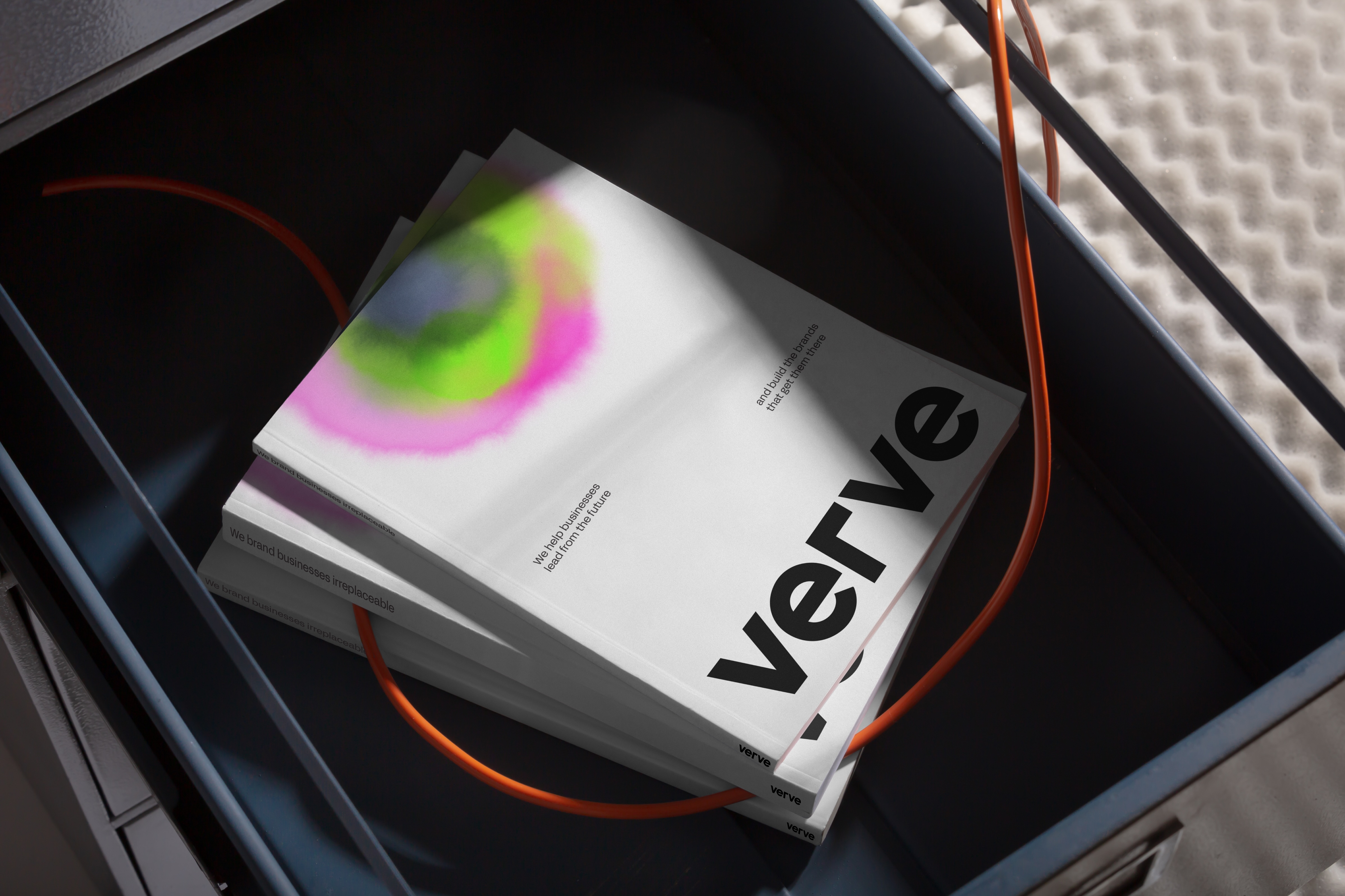
The site is built like a living canvas: a fusion of the physical and digital. It’s watercolor and marker, but it’s also motion algorithms and data-driven animations. That blend makes it unpredictable in the best way. A “one-of-a-kind creation” every time someone experiences it.
Because when you dream without limits, you create work that becomes irreplaceable.
Patrick Boyle
Senior Marketeer & Copywriter
As the person responsible for how Verve comes across to the world, I was essentially the client in our extensive refresh process. I’m the annoying content guy making sure that what we created didn’t just look beautiful, but functioned well for my day-to-day production needs.
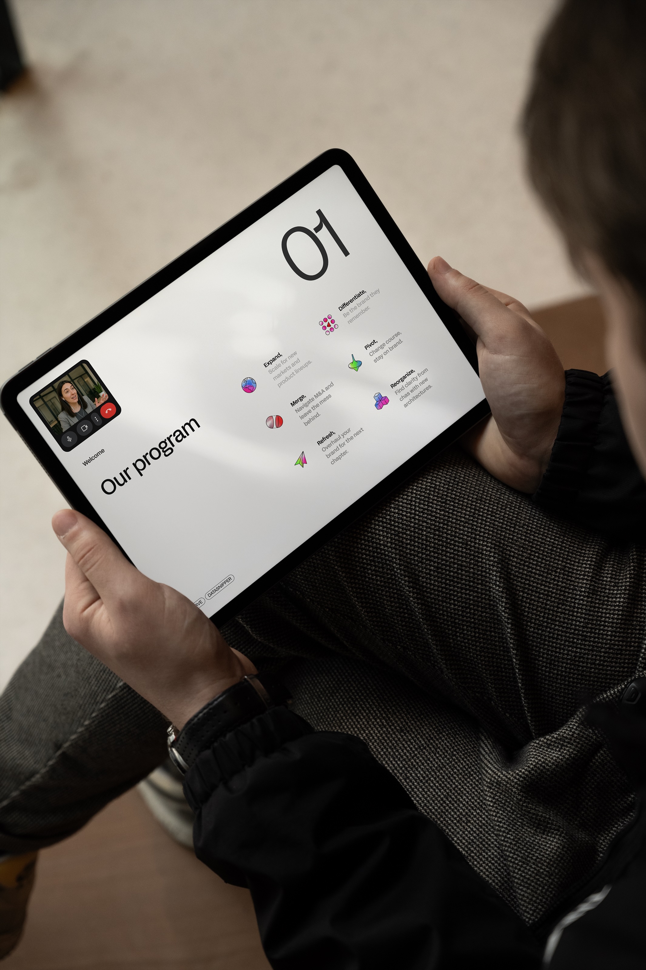
From the moment the our Brand Auras came to life, I knew Walewijn, Sarah and the team had found something that we could scale across every touchpoint. From a static post to a motion background, from sales deck to a creative editorial piece (much like the one you're reading right now)
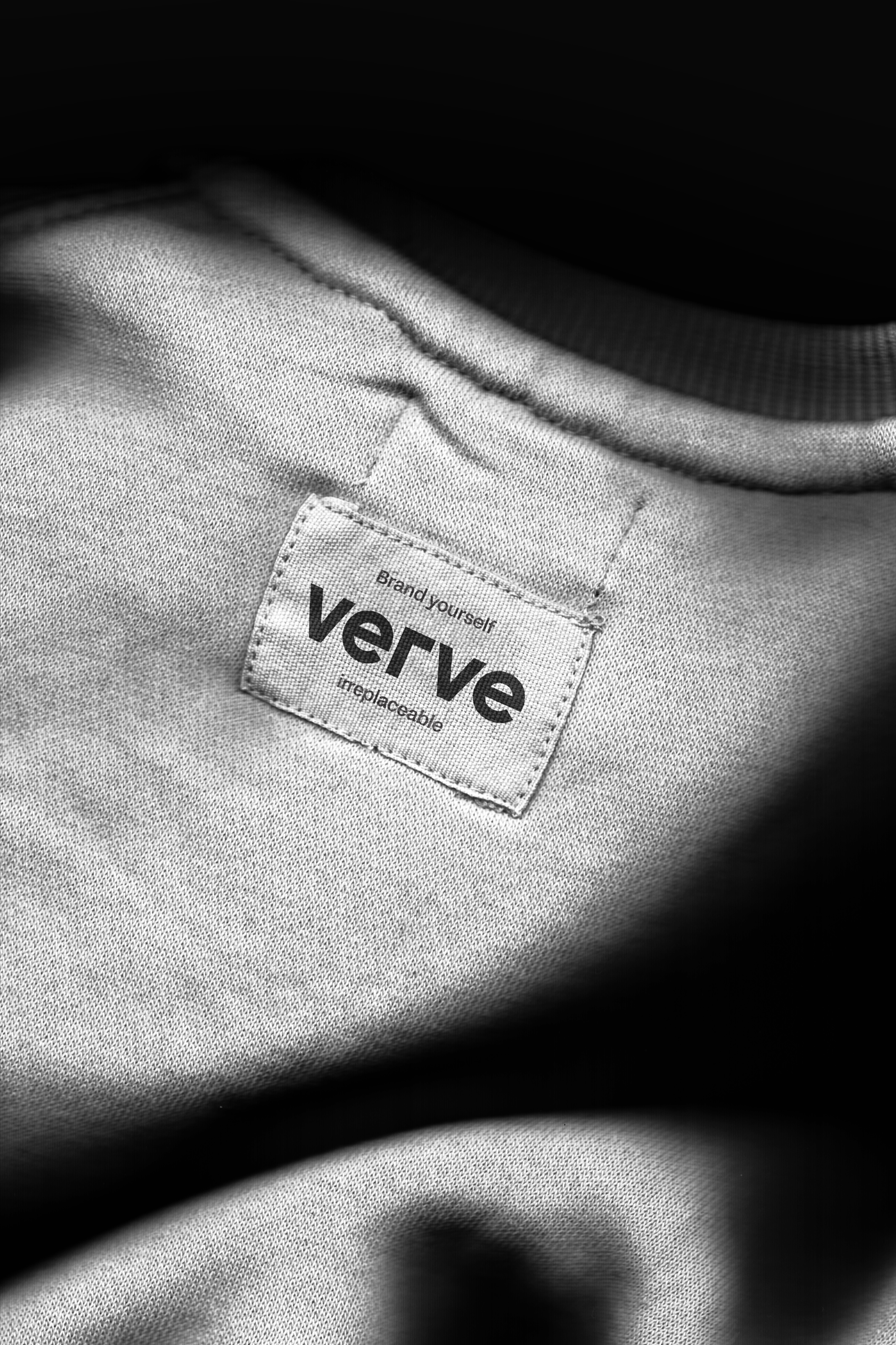
Verve’s library of Brand Aura is now my creative toolkit. Each one feels different, but they all belong to the same family. They’re expressive, flexible, and endlessly adaptable: just like the brand stories we tell every day.
Visuals like these make sure we’re not locked into a rigid template. They act more like an ephemeral container for our own content, rather than strict rules for usage. They hold whatever narrative we need to tell, but they always feel distinctly Verve.
In a way, this new system reflects how we communicate as a brand: fluid, expressive, and led by emotion. It gives us the space to experiment while maintaining coherence. It gives us a distinct language and texture for the stories we tell about irreplaceable brands. And that’s what it’s all about.