Information design for new perspectives
As an agency specialized in creating crystal clear brands for others, it can be hard to define your own. An outsider’s perspective helps cracking your own code. Hence, the reason we were asked to rebrand Clarify, an all-round information design agency that helps convey complex information in a nuanced way.
Creating A-ha! moments since 2003
From explanimations to an organizational consultancy and digital product design, in60seconds, Getting the Picture and Booreiland are joining forces to make complexity understandable. Wanting to profile themselves as the go-to company for information design, overarching company Clarify asked Verve to connect their visual identity to their distinctive illustration work, resulting in information design for and from a new perspective.
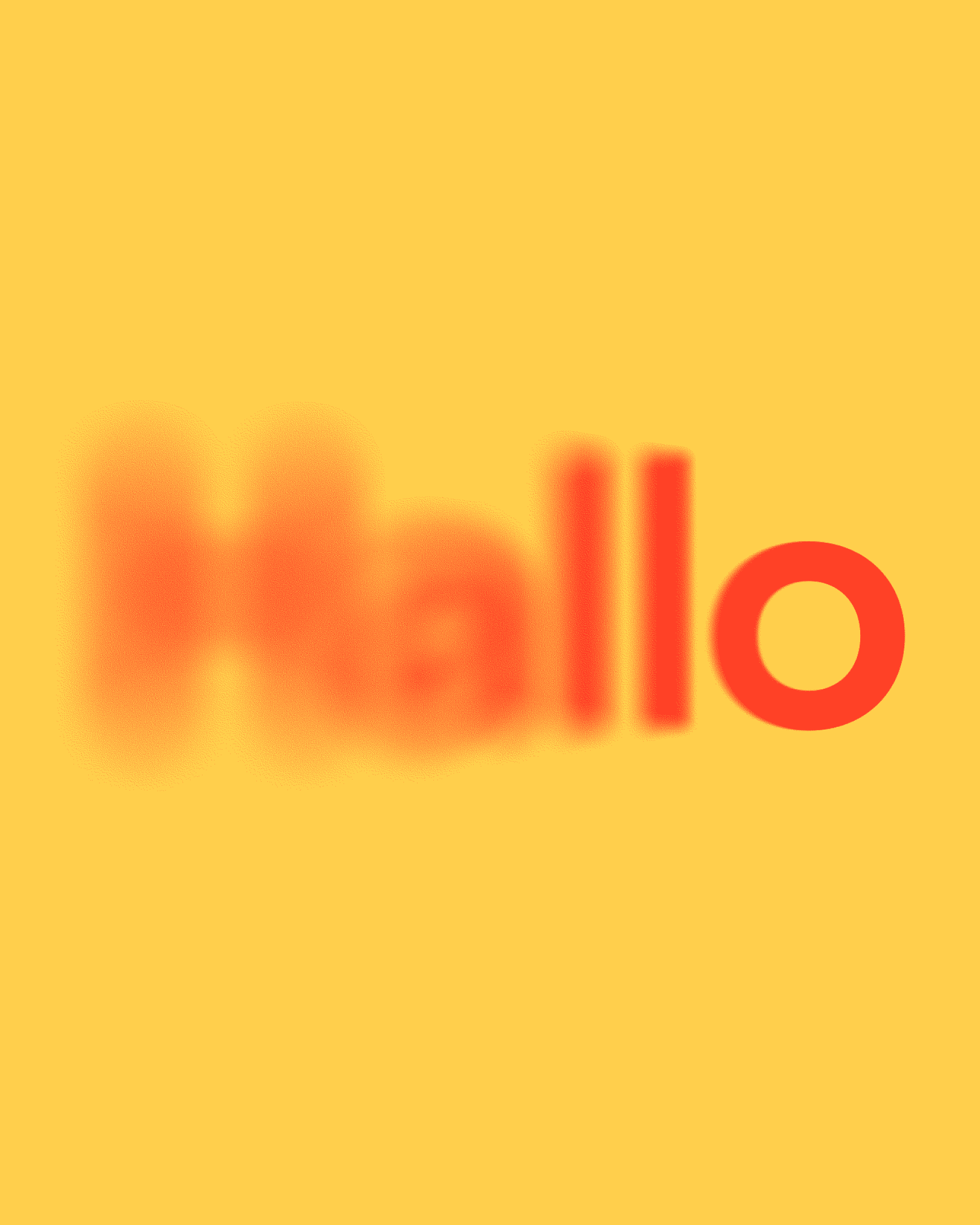
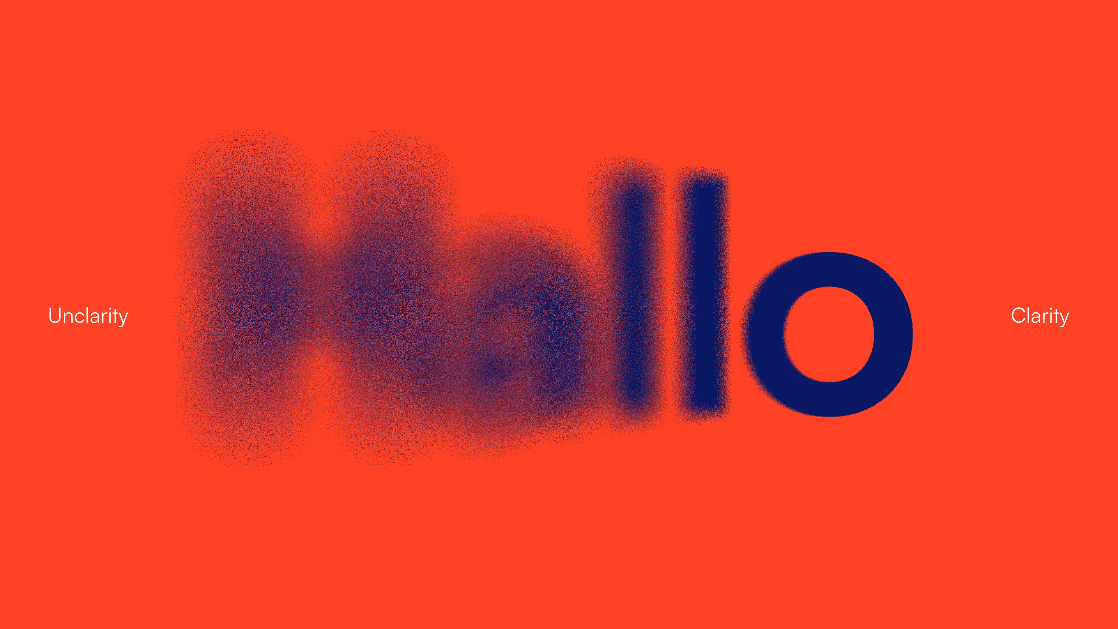
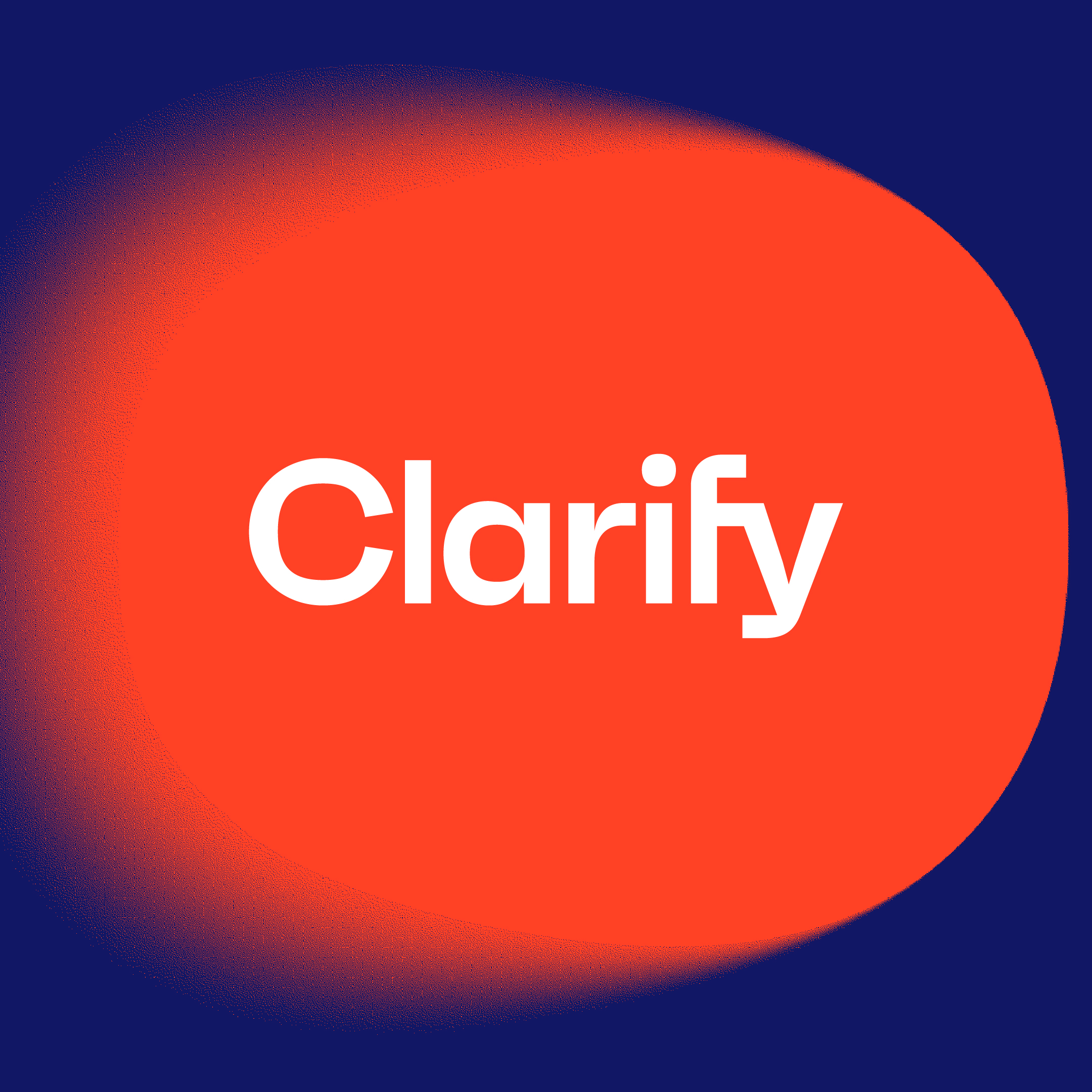
The blur
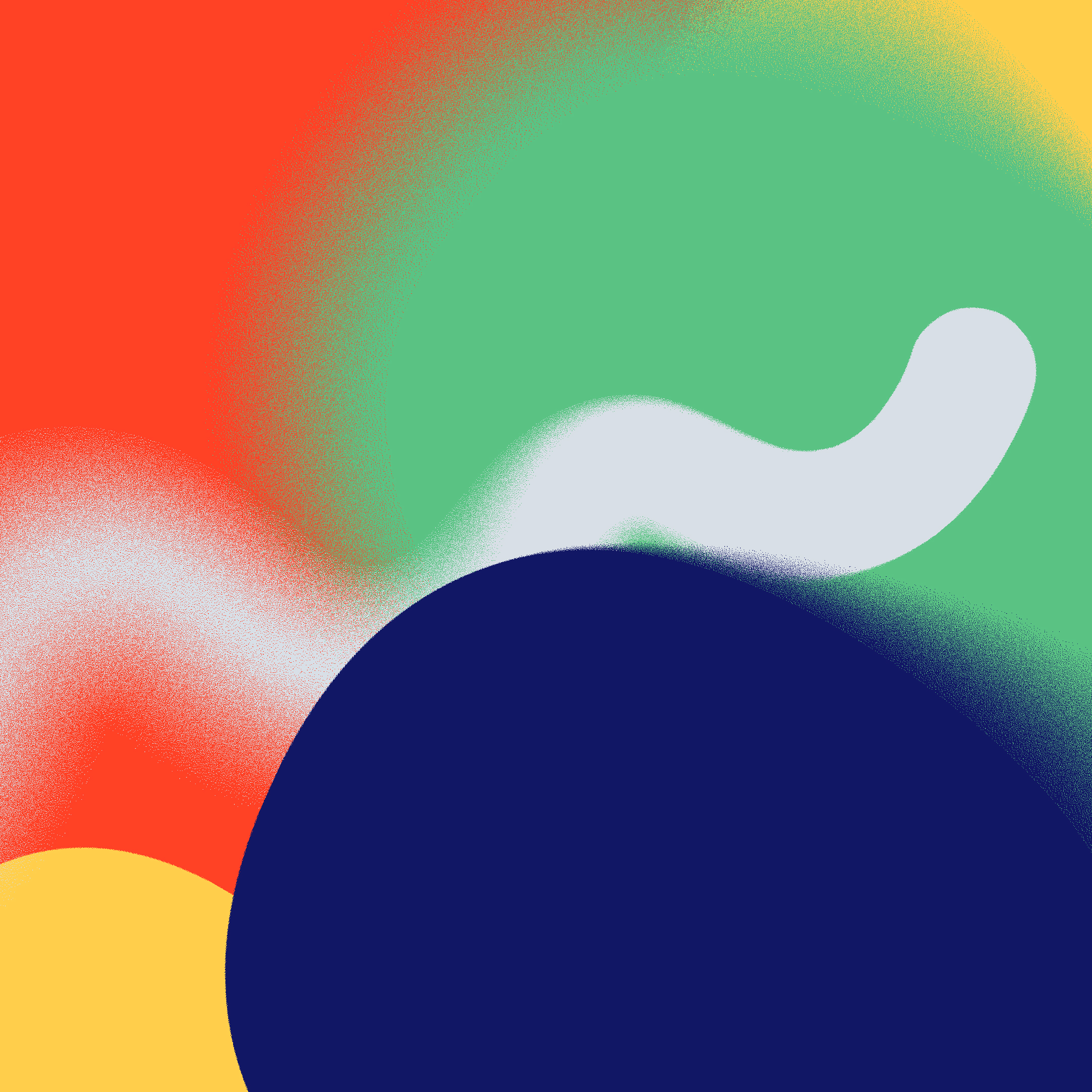
Based on Bob van Leeuwen's strategy, we created a visual concept that’s all about blurring and deblurring. The identity system has a flexible set of rules allowing it to adapt to different needs. From icons to illustrations and from dimmed to vibrant colors. It all represents the transition from unclarity to clarity.
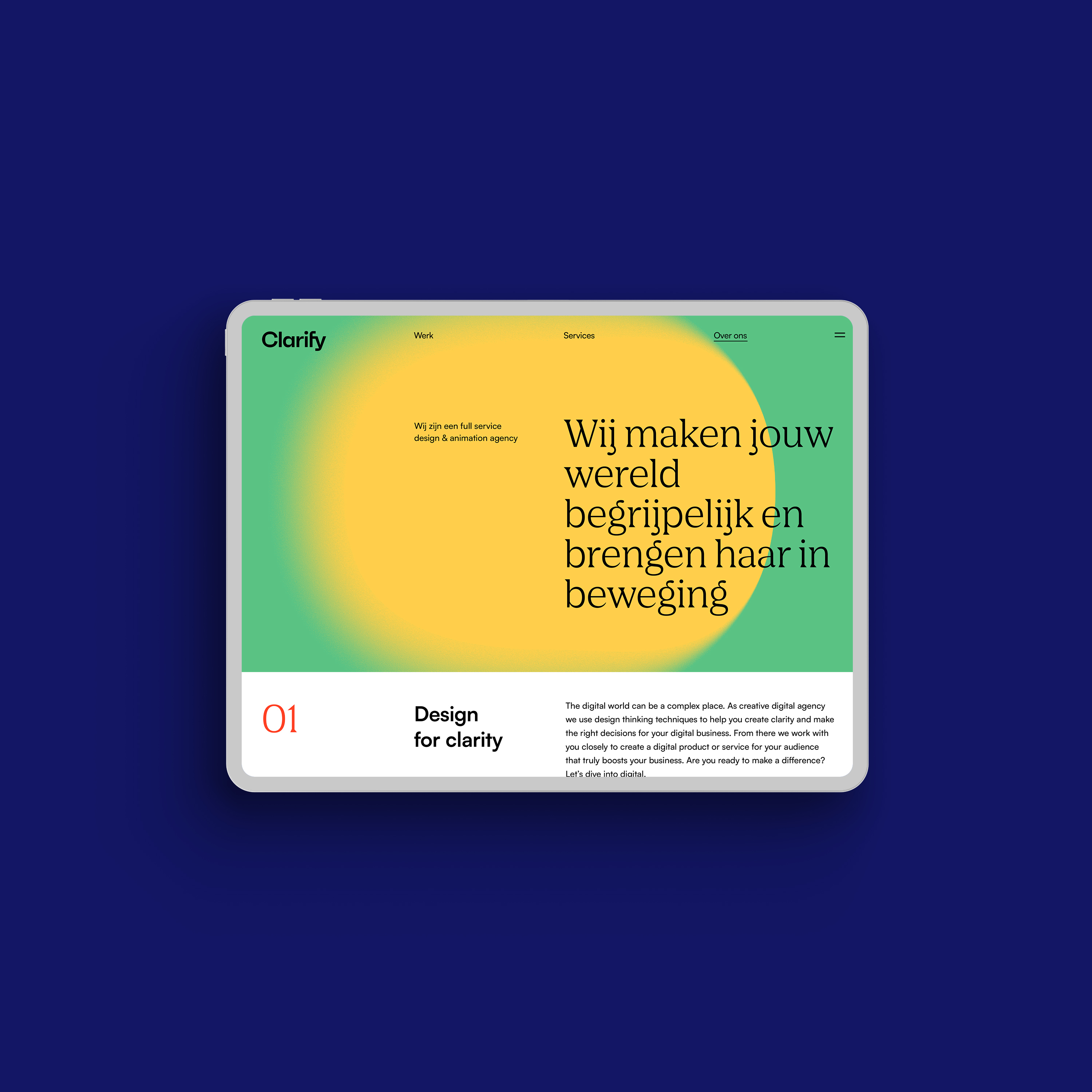
The squircle
Soft, round, yet never perfect. The squircle represents the abstract becoming clear, like Clarify does. We added grid systems to be flexible, yet understandable while resembling information design where the form often serves the content.
Grid systems – Josef Muller-Brockmann
“A grid system implies the will to clarify, (...) to rationalize the creative.”
Just as excited about deblurring brands? Join our team.