Squla is the number one e-learning platform in Europe, used by over 800.000 kids. Due to fast expansion Squla’s visual language became less consistent.
With a focus on empowerment and personalisation, Squla needed a brand refresh that merges product, mission, branding and community. Squla chose Verve to rethink and sharpen the brand's visual identity and positioning.
Pascal Teuling, brand design at Squla: “We came across Verve via our network and the rebranding for Miro spoke to our mind. In a short amount of time we became one team. We turned out to be a great match.”
Verve approached the Squla rebranding as an evolution of the brand. The core of Squla had some strong distinctive brand assets. Ask the target group about Squla and they would immediately say blue and Q. Verve kept those brand assets and broke it down in clear guidelines to service rapid growth whilst keeping the fun in learning.
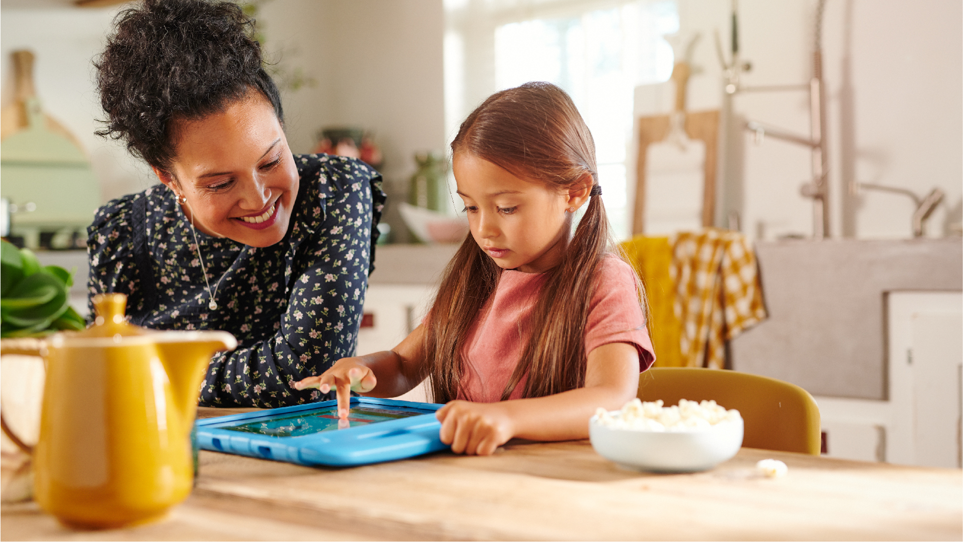
Rounded-off pictures add a touch of friendliness. An endless icon library can be used to tell the story of the 70.000 quizzes and games. A primary color palette functions as a common thread towards a subject. New illustrations by Bobby Pola (Simon Buijs) provide a wink towards an artisanal approach but are clearly digital.
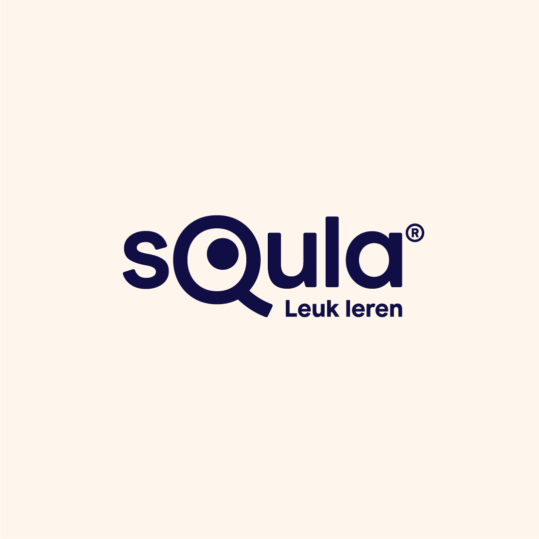
One of the things that flat-out changed is the logo. “Adjusting a renowned logo as Squla's is quite a big deal.” says Teuling. “Verve has succeeded to radically change the logo, but keep its brand essence.”
A clear set of ground rules, a primary color palette for courses and art direction for illustrations and photography, will help to strengthen the Squla story across assets. Preparing them for a playful path to growth. Teuling: ”We look forward to building a consistent brand experience across touchpoints.”