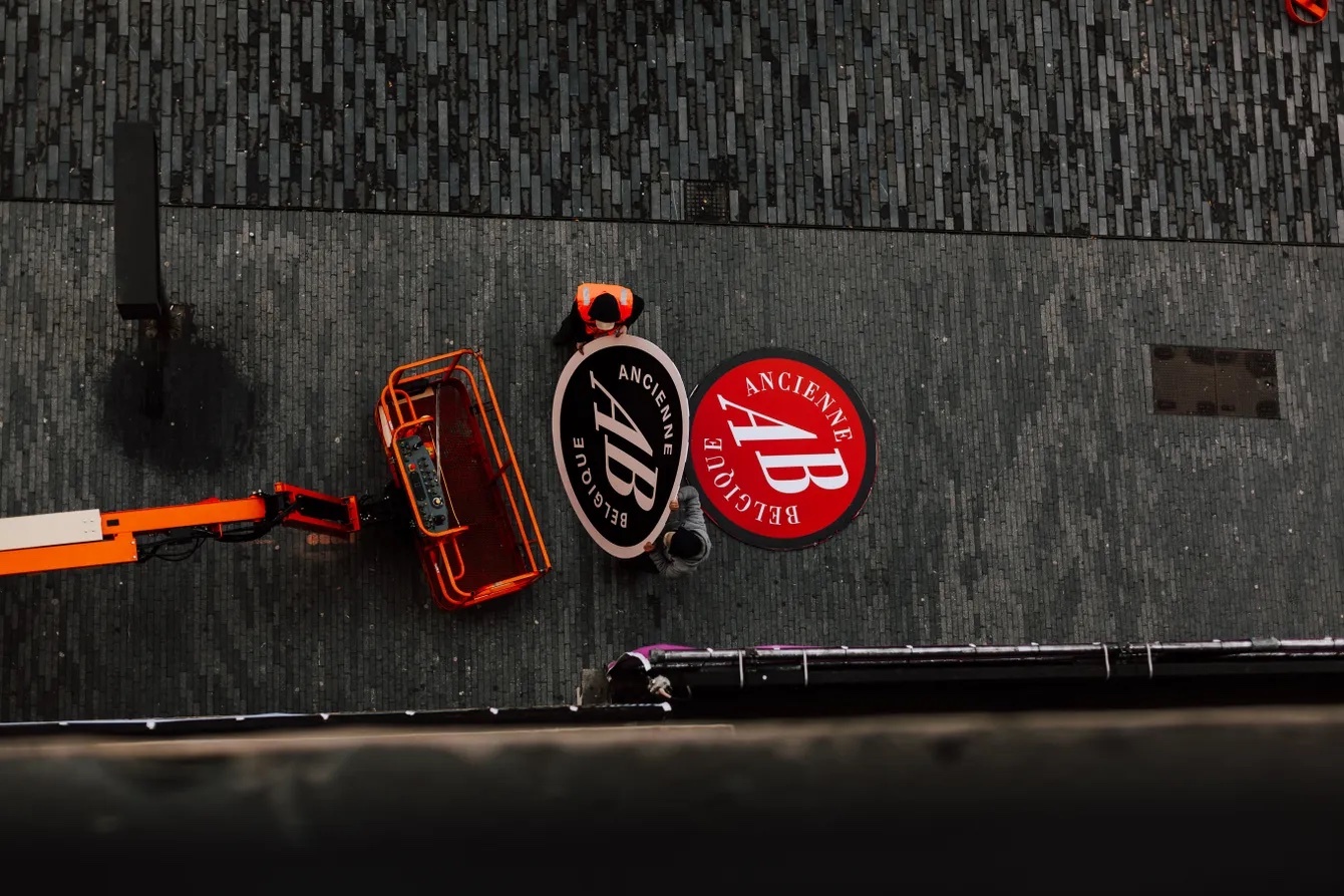
Ancienne Belgique is iconic in the European music scene.
The concert venue has welcomed thousands of renowned artists and sets the scene of both live music and sustainable entrepreneurship. All this time, Ancienne Belgique (AB) has put others center stage. Together with Verve, Ancienne Belgique worked on an identity that starts your concert experience way before you enter the concert hall.
Now, a full year after launching their renewed identity, it’s time to reflect on the rebranding process from briefing to launch with Ward Cannaerts (Head of Marketing Ancienne Belgique), Walewijn den Boer (Brand Design Lead Verve) and Justine de Bruijn (Head of Operations Verve).
To change or not to change
The bright-red logo of Ancienne Belgique has been dominating the streets of Brussels since the early 90’s. According to one of their visitors the logo is “just as iconic as the golden arch of McDonalds”, and changing it should not be taken lightly. “Ancienne Belgique has been doing great. We sell out shows and have a good reputation. We wanted to make sure we could continue our spree for the next 40 years to come,” explains Ward. “It is time to shift focus to the future and here and now of Ancienne Belgique. That’s why we wanted to shift from a physical venue to a brand universe that speaks to a younger generation.”
At Verve, we believe that a rebranding should feel like a natural transition, not a revolution. Even when you want to shake things up, you want to stay true to the core of the brand. Walewijn explains: “The starting point of every rebranding is finding the absolute essence of a brand. By getting to know the brand from the inside out, we can decide what parts of the heritage should be embraced and remain unchanged and which elements are open for reinterpretation.”
-Tina-Herbots.jpg)
Vibing with Ancienne Belgique
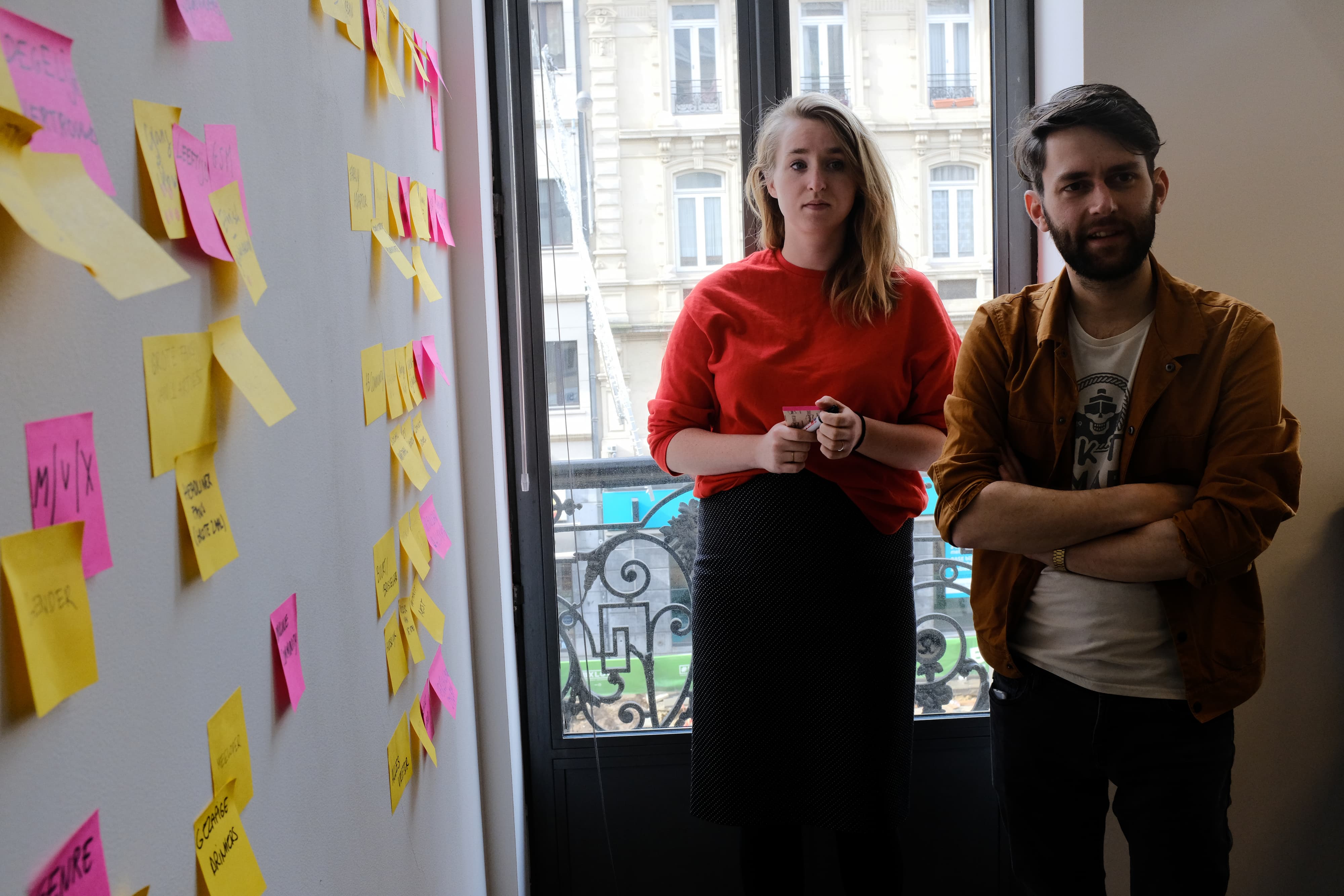
That’s why the Verve team traveled down to Brussels. In multiple sessions, we sat down with the complete AB-team and visited a concert to dive into the Ancienne Belgique-vibes. “In the strategic sessions we extensively discussed AB’s history, values, audiences, and market, but also shared personal experiences. We left with a clear vision of who AB is and where they want to go, and also what they don’t want to be.”
Ward advises other companies to go through a similar process: “Go deep and really expose your foundation. Analyse your brand/company to the bone. It will bring up a lot of discussions and emotions, but it’s the only way to go forward and build your future. We were really challenged to take a step back, move away from our personal experience and look at the total picture.”
"We got in touch with the aura of the place, it felt dynamic and active. You could sense it’s the birth ground of many legends."
During our visits, it became clear AB is a very human and creative place. There’s a lot of emotion connected to the intense experience of a concert. The identity has to embrace and embody this sentiment. Walewijn adds: “We got in touch with the aura of the place, it felt dynamic and active. You could sense it’s the birth ground of many legends. The intimate setting and the phenomenal sound quality stood out. What also struck me was the many audiences they welcomed. They offer something for everyone. But also want to make a real statement themselves. I tried to capture all of this in one identity.”
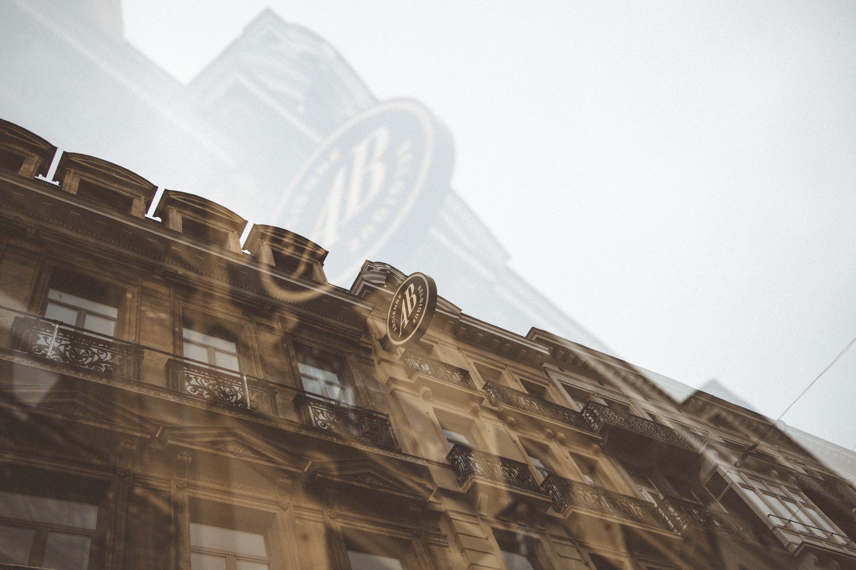
One thing was sure: the logo wasn’t up for discussion. Ward explains: “The logo was a sensitive subject. There were a lot of discussions, but our conclusion was: what’s good must not be changed.” Walewijn adds: “We decided very early on in the project we would keep the original logo but tweak it, and build the brand around it. The logo now forms the core of the brand, from which the new identity and multi-dimensional brand system can grow.”
Getting everyone on the same page
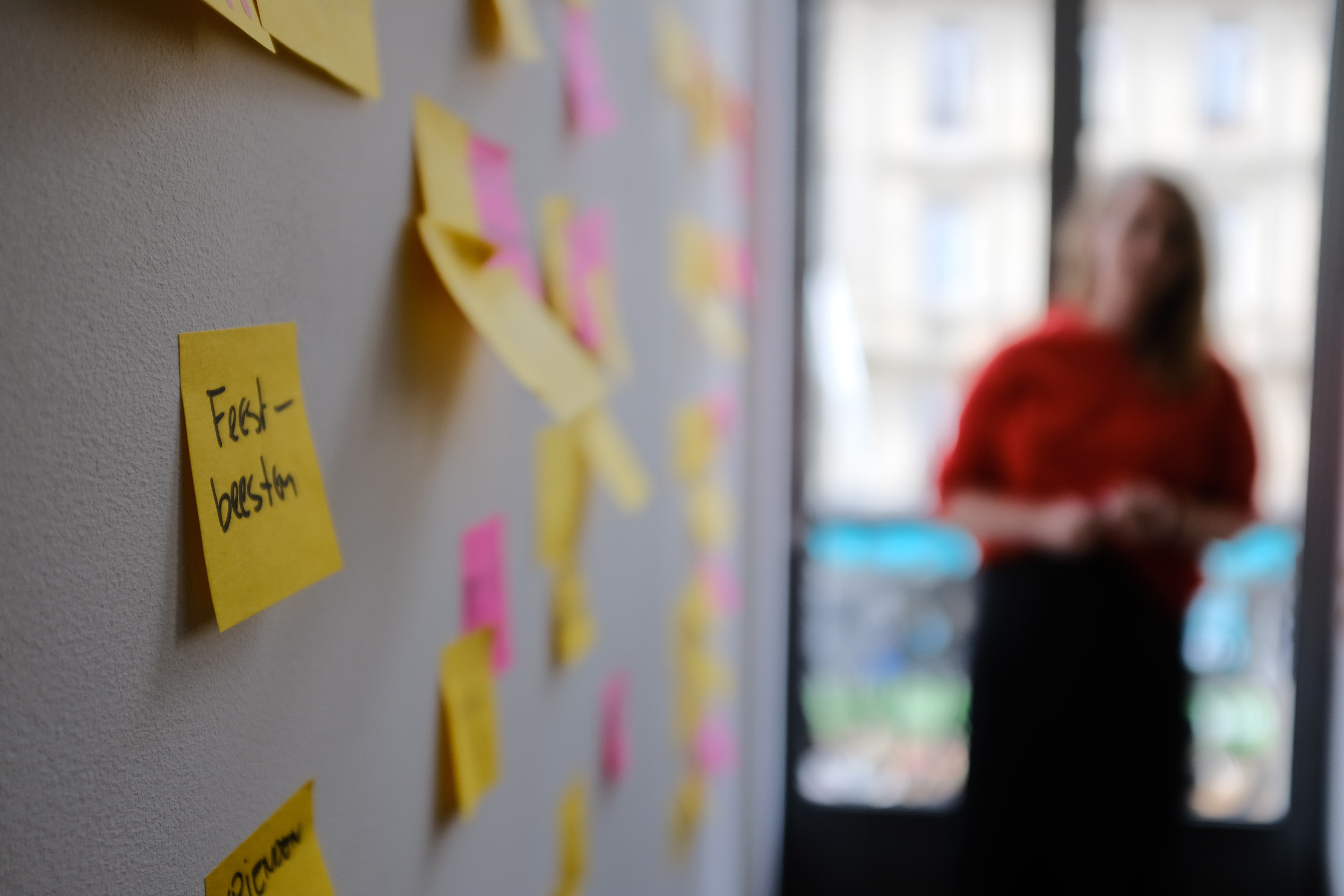
There are multiple routes to take for an identity to stick. By making the process a collective effort, we collected a variety of experiences, ideas, and visions. With this input, we went back to the drawing table and presented mood boards and storylines to a focus group of potential and existing AB-visitors. Justine adds: “We tested the new AB- propositions by conducting qualitative research. A group of twelve visitors - Flemish and Walloon - were asked to share their thoughts and feelings. Their answers confirmed we were on the right track. These insights also helped increase support for the rebranding internally.”
The project didn’t end with the delivery of just an extensive brand book. Walewijn: “We helped Ancienne Belgique to implement the identity in many ways. We joined the interview process for a new design position and art directed the deliverables made. We did everything to make sure a quick day-to-day production of designs is possible. At the same time, we provided clear guidelines so there is room for custom work.” Justine likes to see this more often: “AB is an example for other companies: they know the value and importance of good design. They even invested in new in-house designers to implement the identity.”
Plan your launch
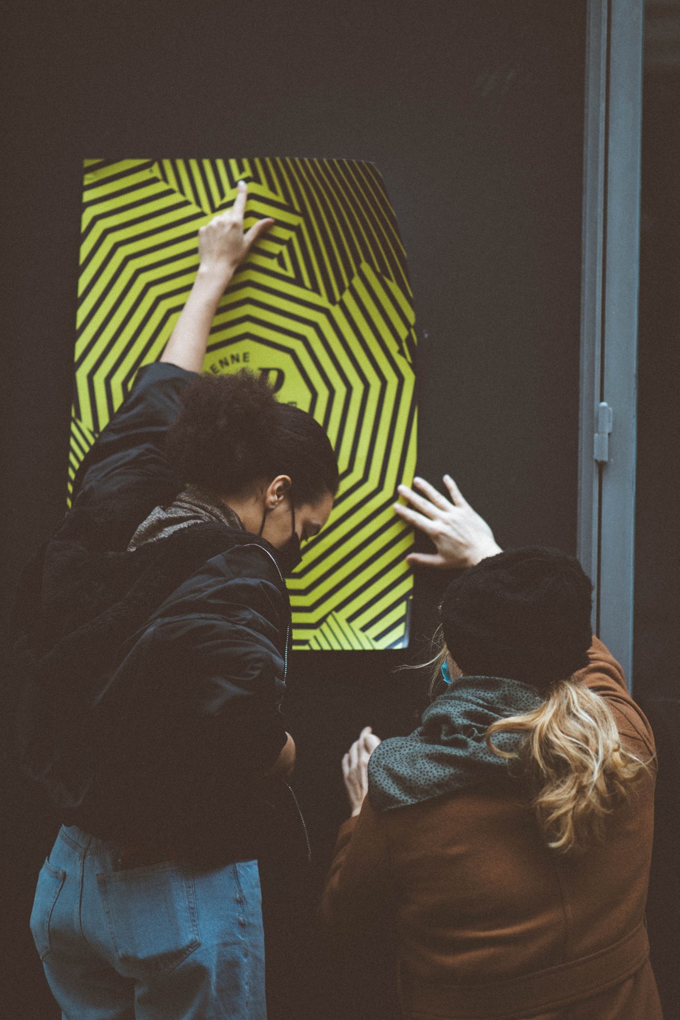
With Covid-19 forcing concert halls to close their doors AB decided to postpone the launch for a couple of months. Ward: “In the end, we decided to launch during lockdown. The feeling of missing out kept growing. We wanted to counter this by creating a sense of hope. Post-lockdown we want to look forward to a bright future, not look back to the past. This way people would also get familiarized with the new look.”
"We wanted to counter the fear of missing out by creating a sense of hope."
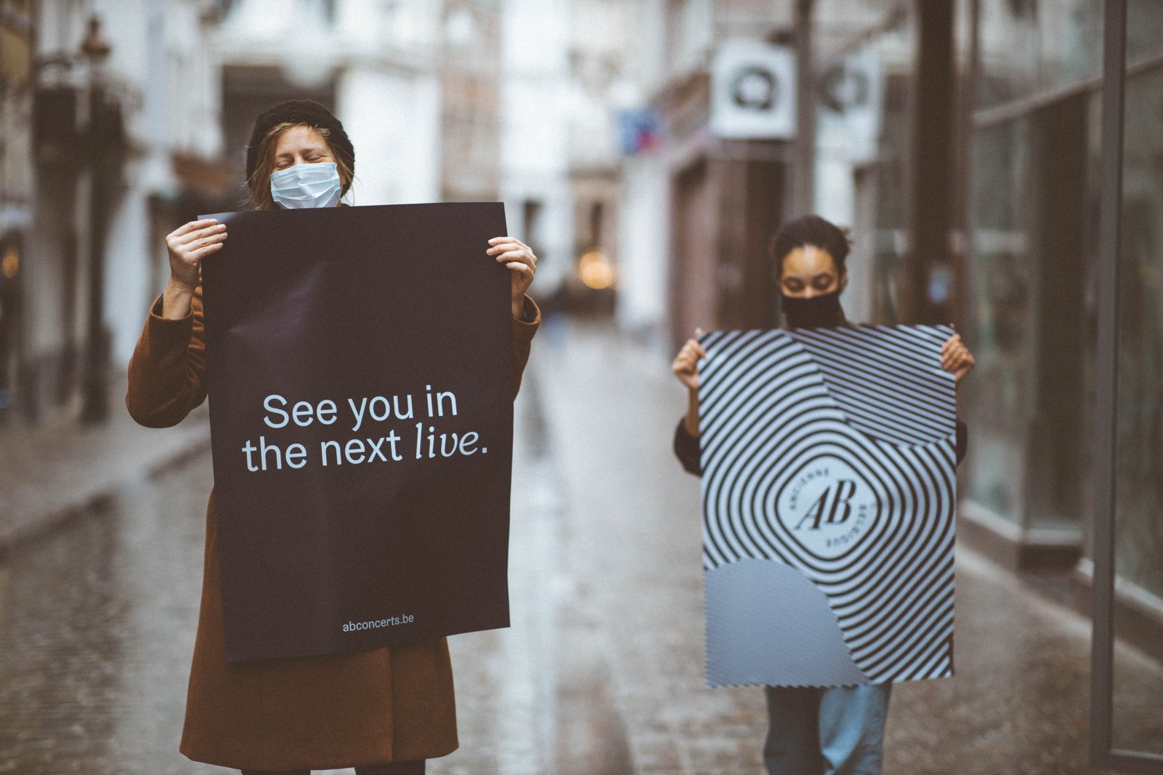
The new identity opened ways for new sustainable marketing and communication concepts: Ward: “We linked the launch of the new identity to a message of hope: ‘See you in the next live!’ We addressed the public directly and used AB ambassadors to spread the message.” AB created a video and influencer marketing campaign, a series of stories about famous Brussel musicians, a podcast, and more. Ward’s advice: “Connect every story to a specific content format. It opens doors for collaboration and focused (brand) storytelling.”
Ready for the next live
Walewijn: “This identity is ready for the future. It’s flexible and has endless motion potential. From digital screens for user interaction, or programmed LED lights and projections. Like a guitarist you can create an infinite amount of combinations with the same set of chords.” Ward adds: “This identity gives us the opportunity to really show who we are. With the amplifiers, we can communicate on an emotional level. It adds fireworks to this already intense energetic place.”
The brand system is flexible enough to evolve. New amplifiers and colors can easily be added to the system. This is the result of rethinking brand identity ‘rules’. Walewijn reminds himself and others: “Feel free to ditch all the ‘rules’, Be open-minded, unconventional, off-beat and create your own logic. Just experience, learn and listen. That’s how we got to a system built out of six amplifiers and fonts. If something is smart and good it will keep growing.”
Excited to read your brand's behind the scenes story next year? Get in touch.
