Caya

Redefining document management

Dog ears, folders and joyful delight: We tap into old-school office tropes to create a resonating SaaS brand for Caya. Life’s too short to spend it on paperwork. On the other hand, a proper document flow can be a time, money and life saver. Caya helps business owners get their paperwork into a manageable state, quick.

The problem

Berlin-based Caya challenged Verve to uplift their paperwork-y brand with a vibrant identity and conversion-driven website. One that felt as seamless as their service and as emotive as their passion for workflow automation and paperless offices.

Auto-magic workflows

Caya’s new brand identity needed to be instantly recognisable. It has to be able to speak through abundant landing pages as well as tiny UX-elements. We came up with timeless symbolism, living characters and vibrant auto-magic features. Together with UX research and digital design, Caya’s identity came to life on all assets. 

Low-code revolution

Under the hood, and in close collaboration with Cut the Code, we managed to realize the website using low-code. Developing high end solutions with low-code is not panacea for all things coding, but we do believe Gartner forecasts that by 2024, low-code adoption will be so widespread that 75% of software solutions built around the world will be solved with such tools. AI will play a big role in speeding up this development. We’re thrilled to step in on this no-code bandwagon.

Mockup of a hand holding a phone showing the Caya app, headlined 'Manage all your paperwork in one place' with a document illustration and a yellow 'Get started with Caya' button.
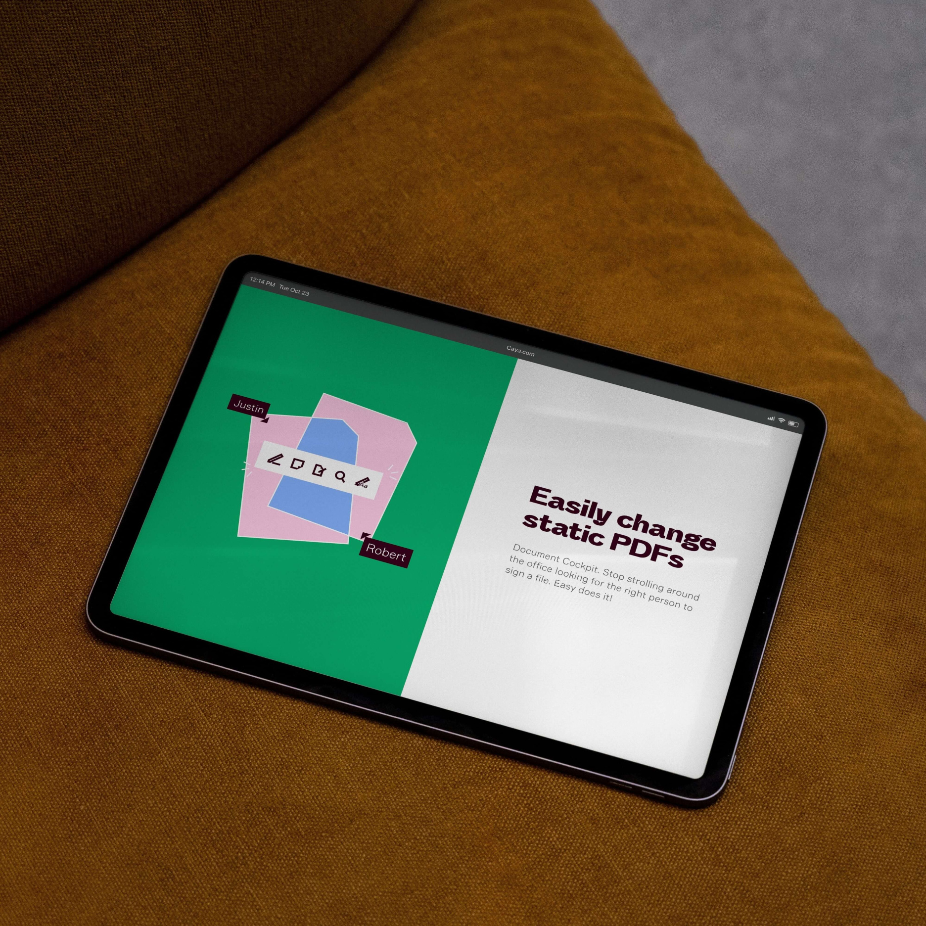
Mockup of the Caya website on a tablet on a mustard sofa, headlined 'Easily change static PDFs' with a green document illustration.
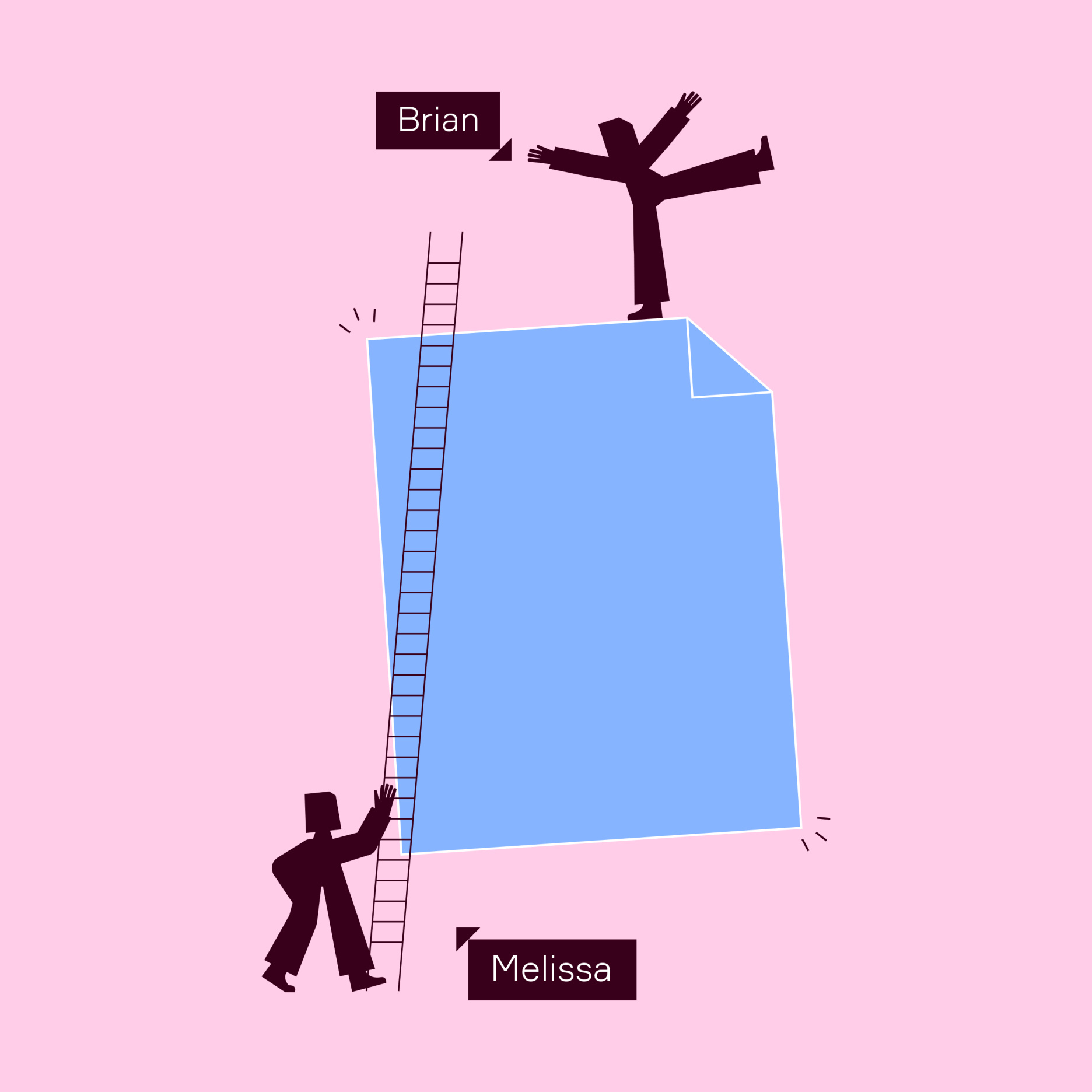
Caya illustration on pink of two silhouetted figures and a ladder against a giant blue document — 'Melissa' holds the ladder at the bottom while 'Brian' stands triumphant on top.
Over-the-shoulder mockup of a person holding a tablet showing the Caya website, headlined 'Work smarter, not harder' with a pink-and-blue document-shape border and a yellow 'Get started with Caya' button.
Animated illustrations
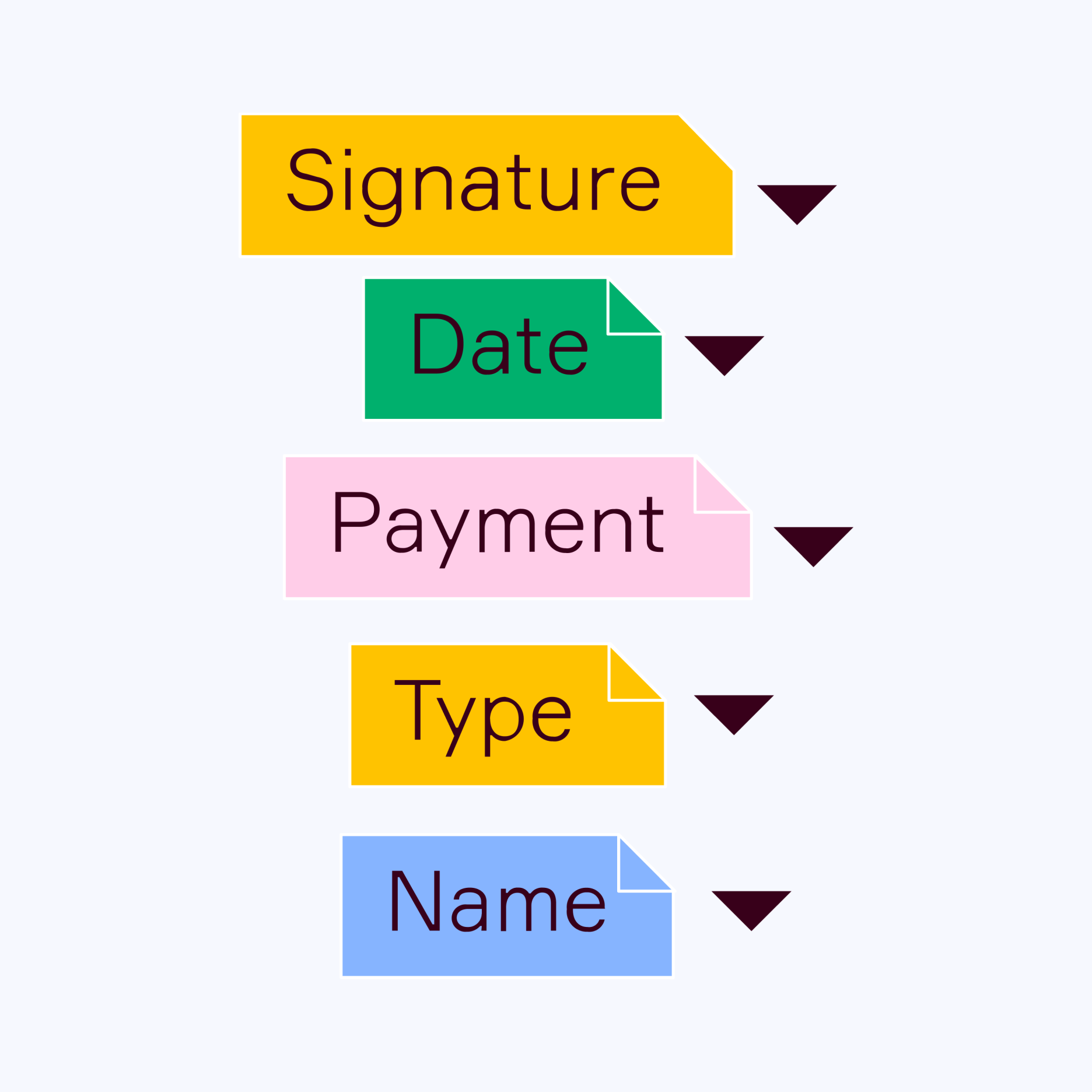
Caya UI graphic of five colored document-tag dropdowns labeled Signature, Date, Payment, Type, and Name on white.
Mockup of a Caya rooftop billboard against a cloudy sky, with the ladder-and-document illustration and the headline 'Bye bye paperwork, hello proper work. Get Caya.'
Caya illustration reimagining the Vitruvian Man as a dark silhouetted figure with a document-corner head, inscribed in a circle and square on light blue.
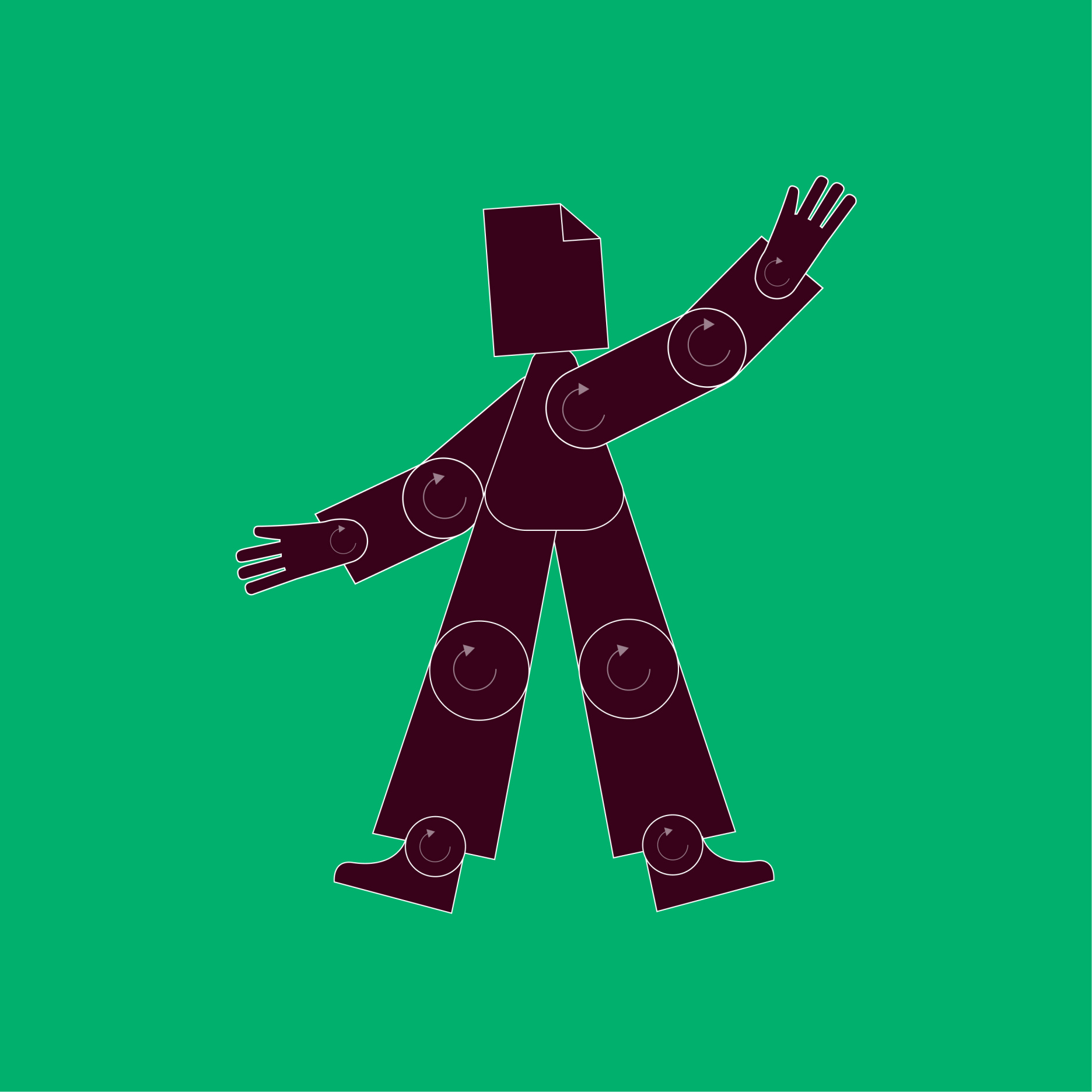
Caya illustration on green of a dark document-headed character waving, its limbs built from segments joined at circular rotation points like an animation rig.
Animated Caya GIF of a small dark figure waving beside a green 'Hi!' speech bubble on yellow.
Mockup of a hand holding up a light blue Caya-branded t-shirt on a hanger against a blue background.

Alexander Schneekloth, Founder of Caya

“The product we built has no reason to hide. With the new positioning and visual identity, we became louder and are being seen for who we are.”


Caya illustration on blue of two dark figures with a large yellow paper airplane - one pushing from behind, one riding on top with arms outstretched.
Caya illustration on green of two stacked dark figures balancing on each other's hands to lift a large blue document overhead.