NLRO
Nederlandse Reisopera’s Baroque-rock opera
How do you break the elite image of opera? Simple: break conventions and redefine the genre as Nederlandse Reisopera (NLRO) does. Say hello to 21st-century Baroque.
Immersive art branding
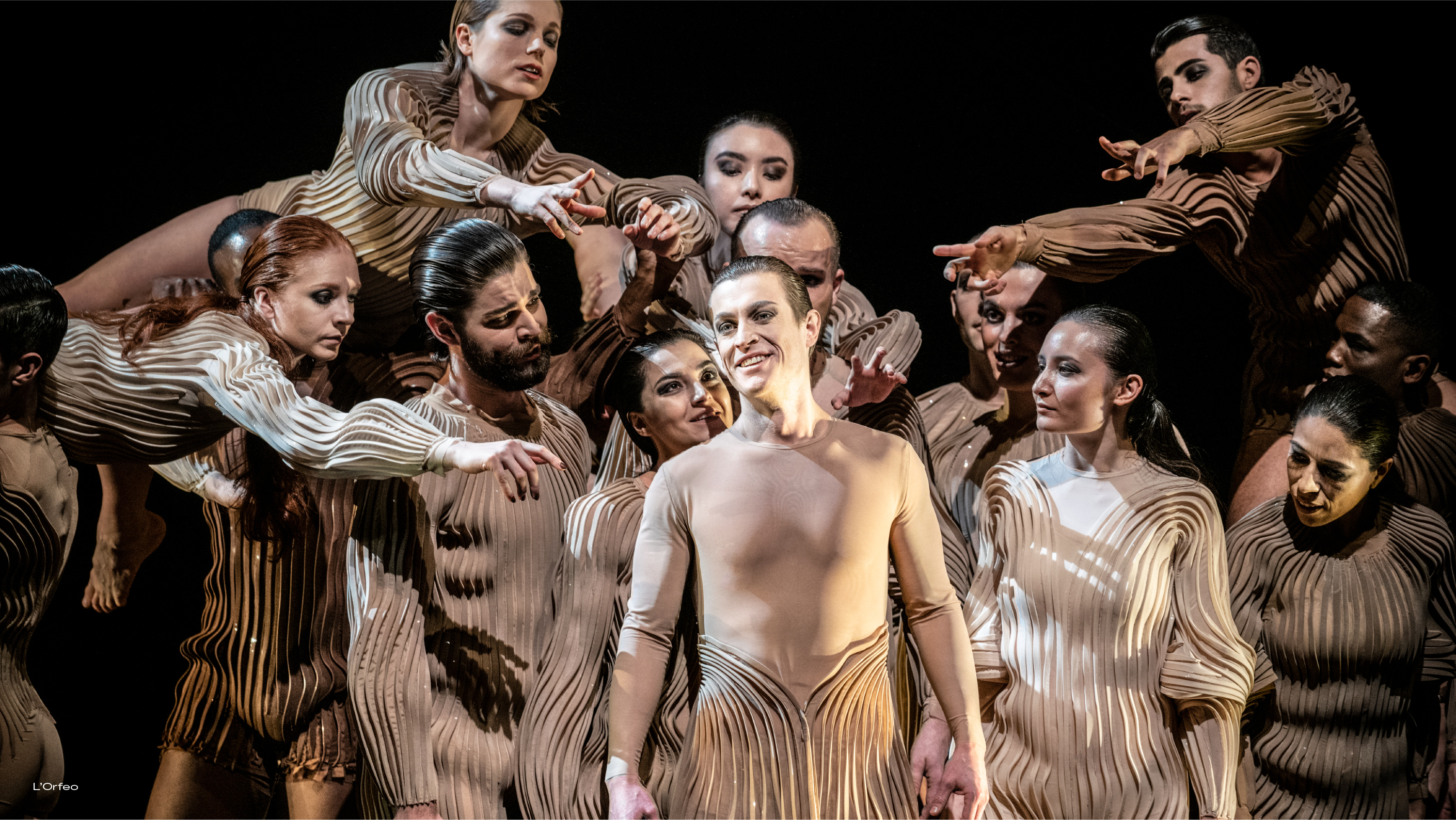
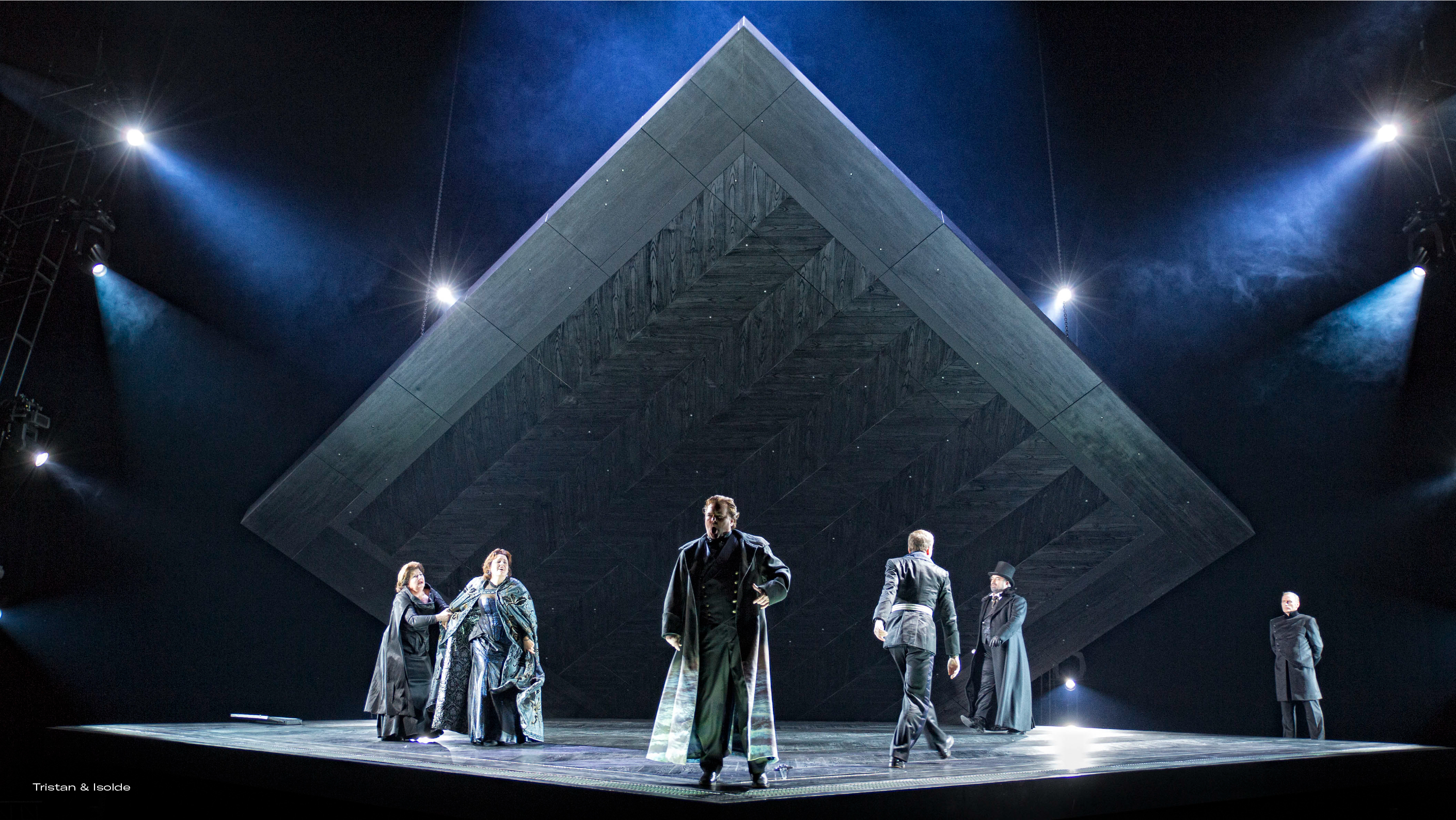
NLRO does opera as it is supposed to be: a complete audiovisual and musical experience. An experience filled with dance, musicians and collaborations across disciplines open to everyone. They need a visual identity that is as inviting, wonky and surprising as they are.
While their shows sell out, their brand awareness is low. People come for the classical masterpieces, not necessarily for them. NLRO wants to create a loyal fan base. According to NLRO, opera does not deserve its elite image. The company asks for a way to break conventions and make the art form accessible to younger audiences.
Breaking tradition
Historically, Opera used to be an art form for the people. A grotesque rendition of the real world, understandable for everyone. Recently, opera has wrongfully been perceived as a high-brow art form; part of the classical music genre. Nederlandse Reisopera takes on the challenge of breaking down these barriers.
Daring, courageous, weird, those are just a few of the words people use to describe NLRO. Known for their contemporary reworks of masterpieces, collaborations with designers like Studio Drift, and their unconventional performances, NLRO moves beyond the traditional perception of opera. Yet, people still buy tickets for a specific show, rather than for the company’s unique character. We defined a framework that NLRO can use to tell their story way before you enter a theater.
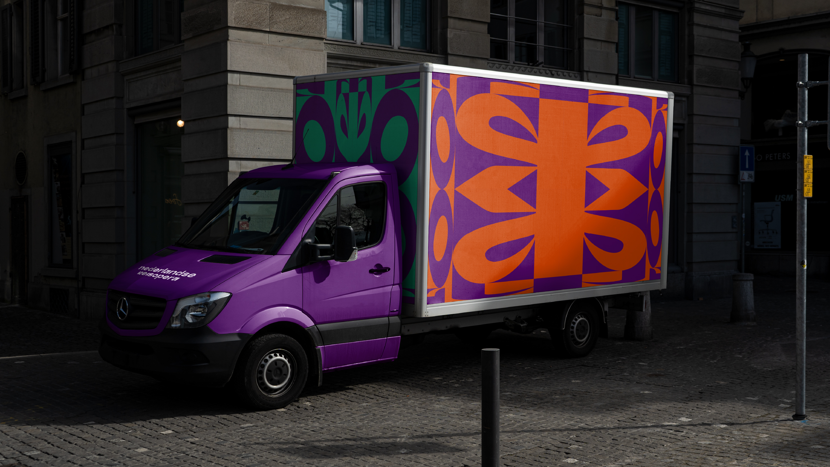
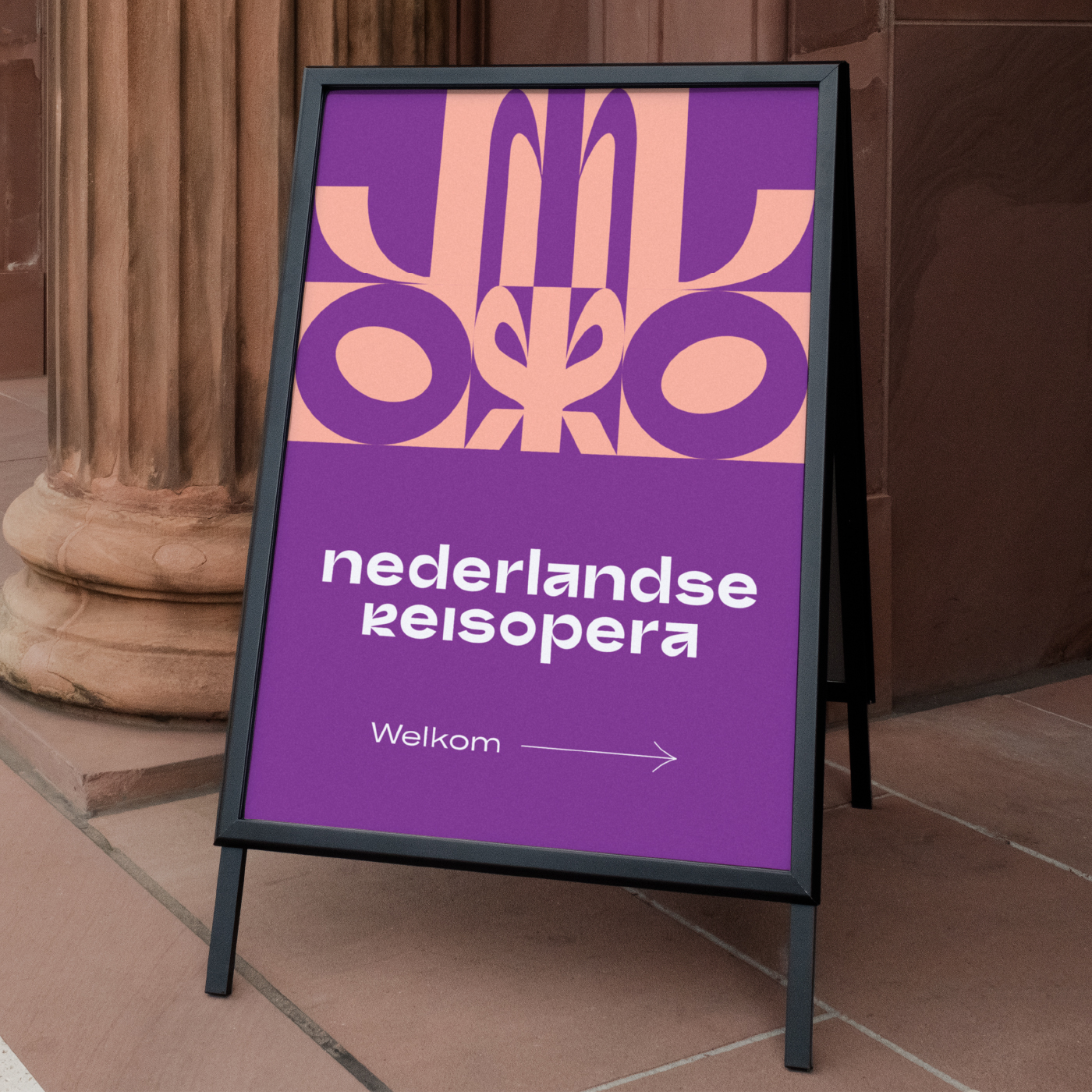
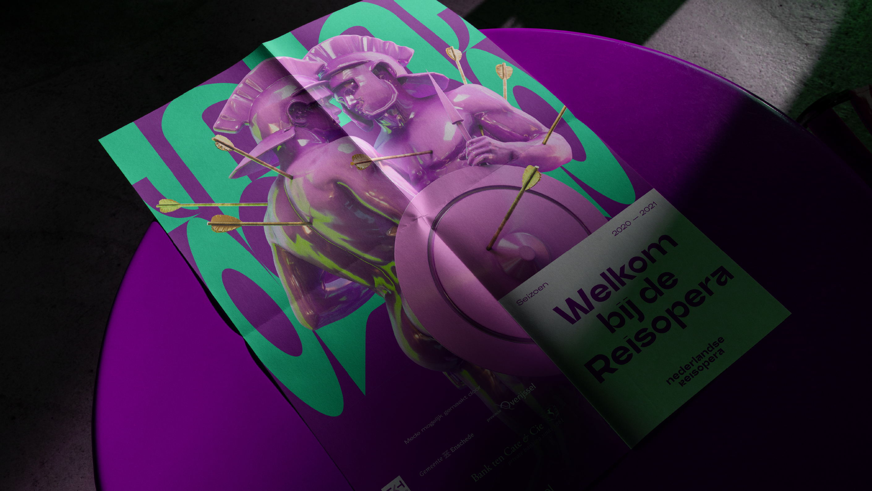
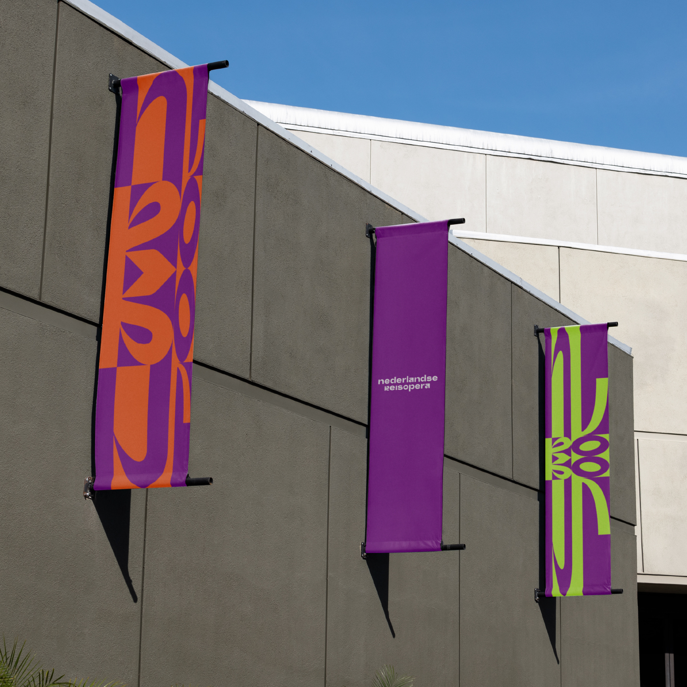
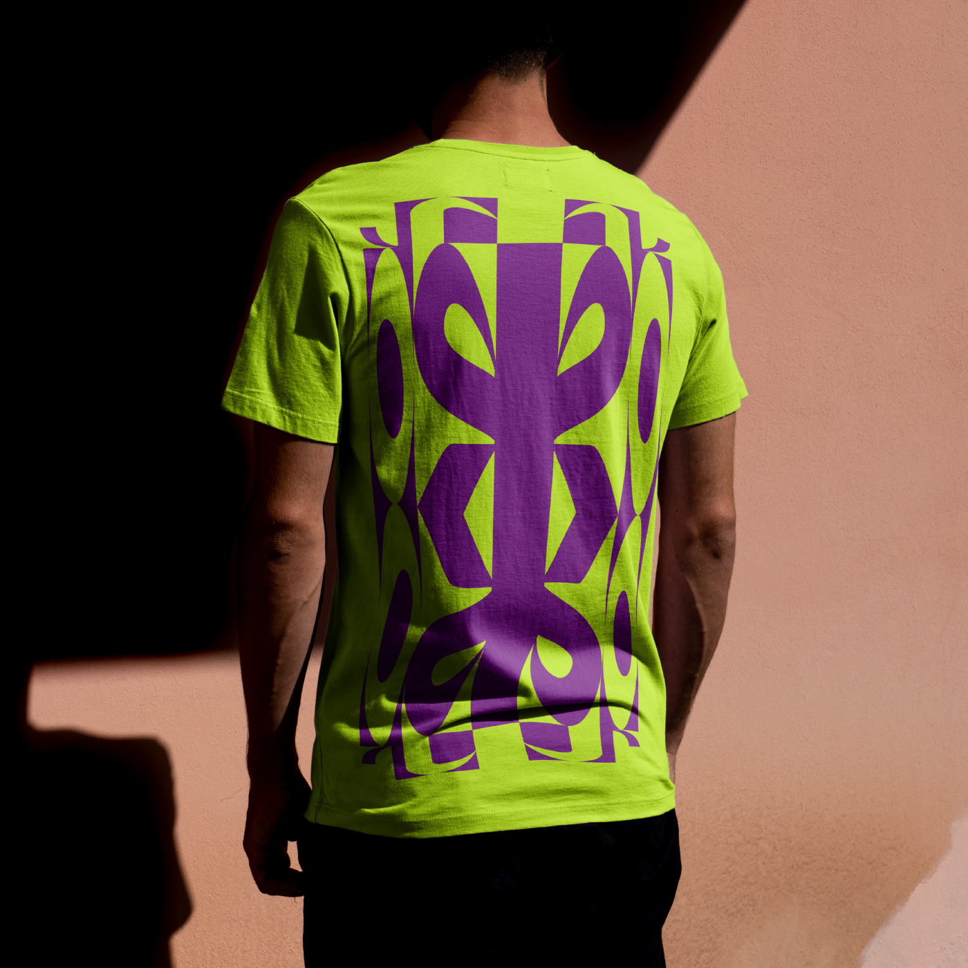
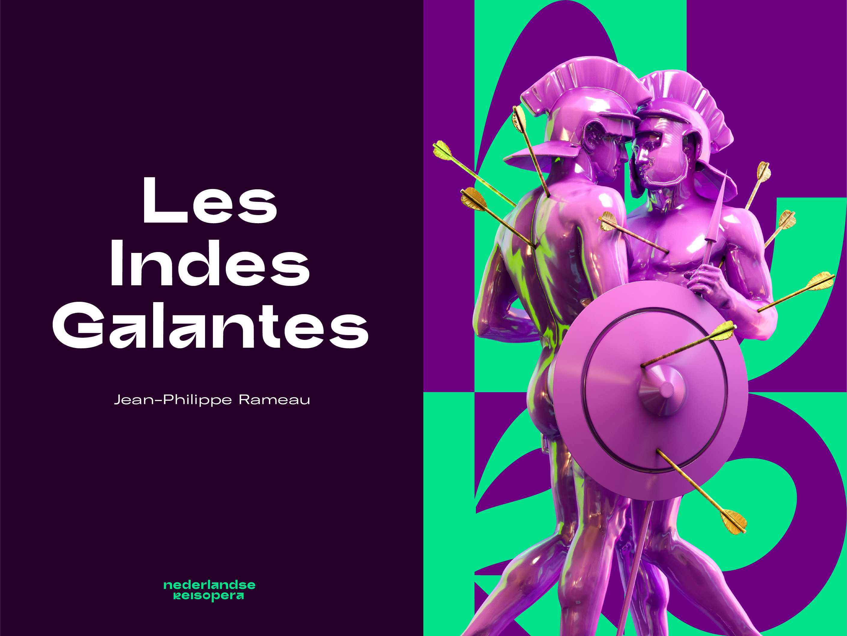
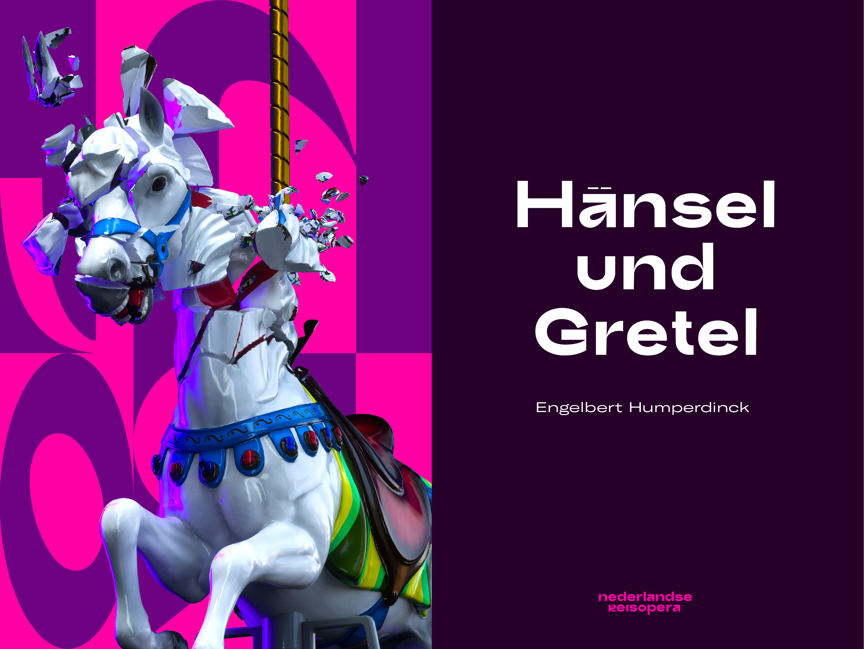
Brutal Neo-Baroque
We were looking for a stylized, yet dramatic visual language. We found the answer in the baroque age, the era in which opera originated. The architecture and interiors of that time are considered over the top today.
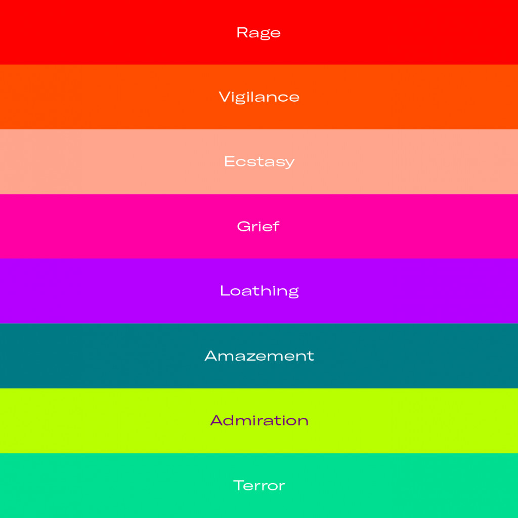
We’ve taken those decorative rosettes, moldings, art pieces, fashion and defined their digital counterpart. The bright colors, named after dramatic emotions like terror, admiration, ecstasy, in combination with the ‘Trash’ typeface flirt with camp aesthetics. Yet, its refinement is found in the details.
Digital aesthetics that move you
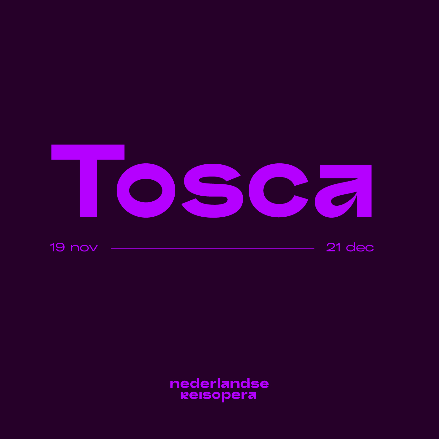
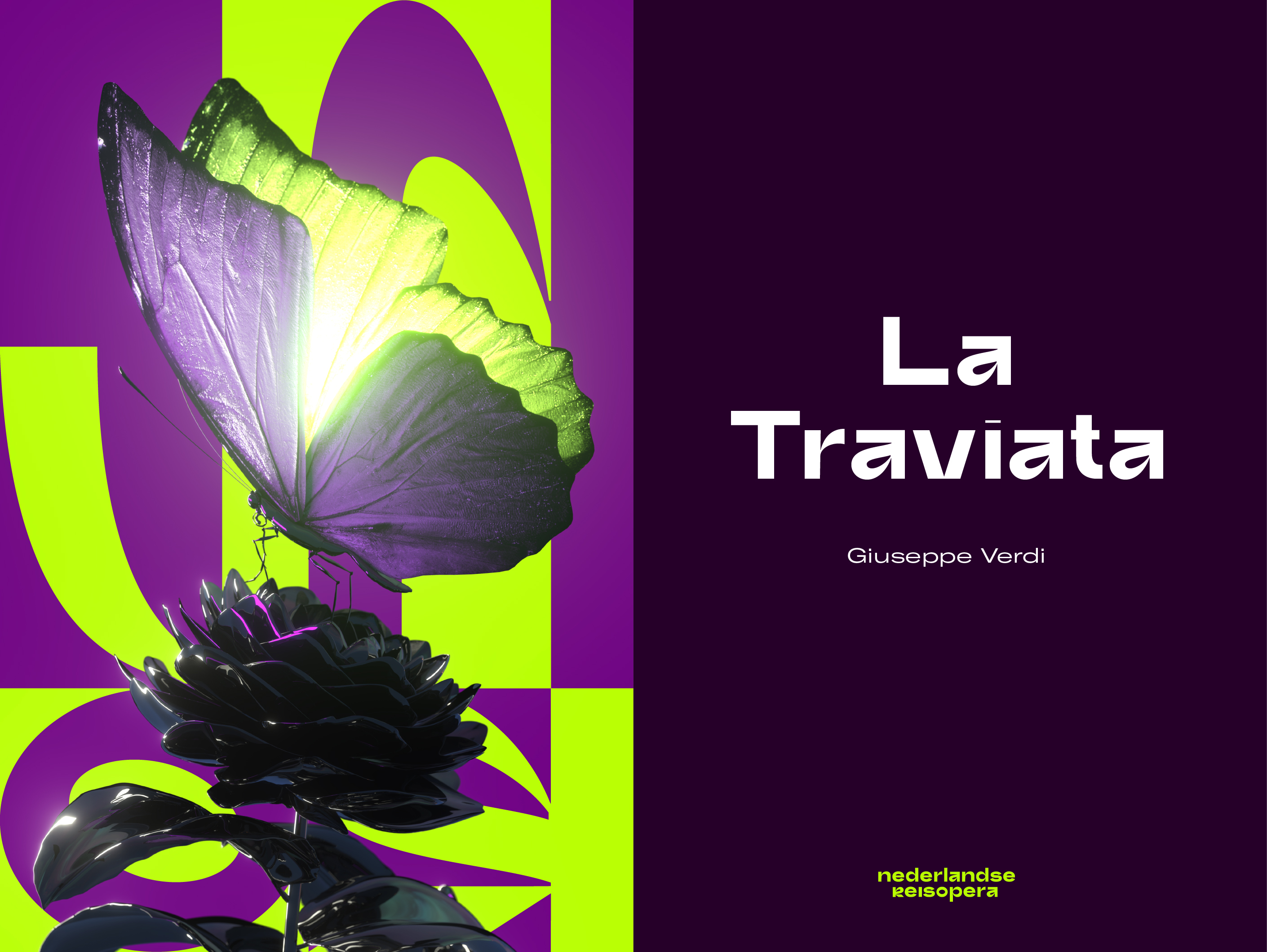
Just like NLRO, the visual language is always in motion. The logo forms a pattern that interacts with campaign-specific visuals. Every season, we aim to collaborate with different artists to grasp the zeitgeist. They could be illustrators, product designers, or visual artists. For season 20/21 we collaborated with 3D artist Christiaan Endeman.
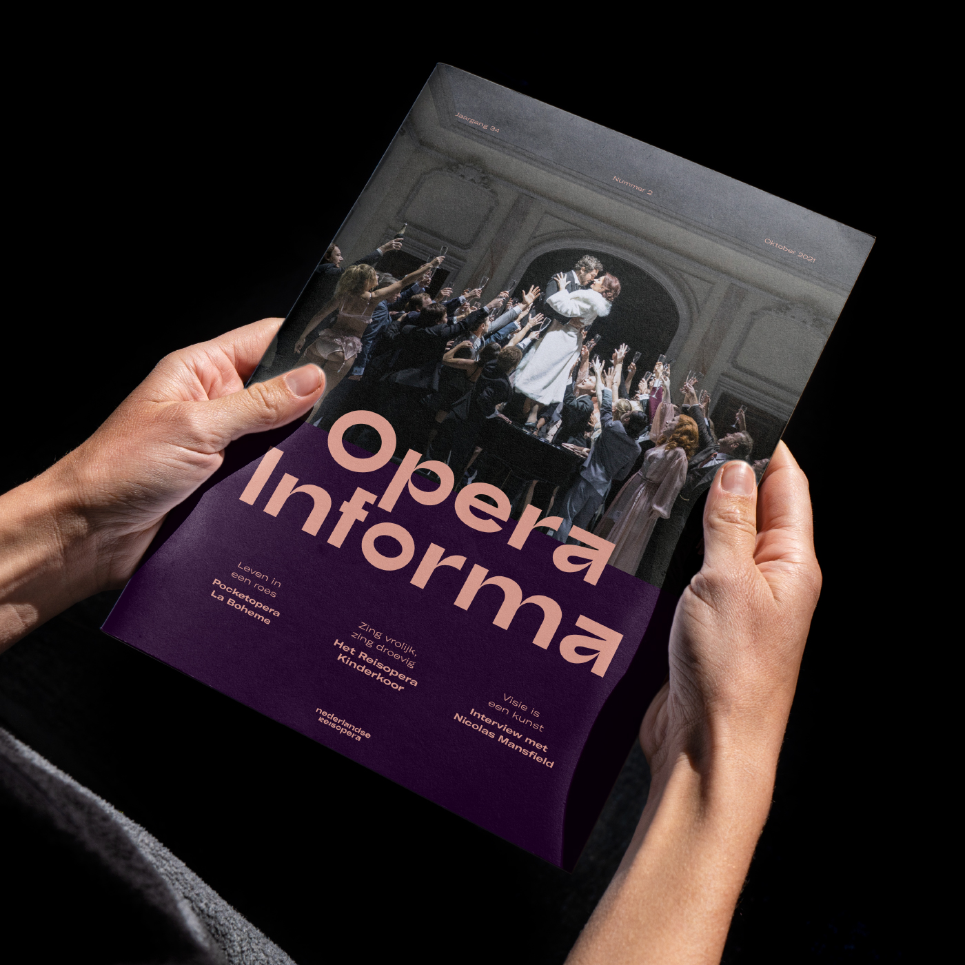
Building upon the insights found in Google Analytics and the report of Hendrik Beerda, cultural researcher, we redefined the role of the website and transformed it into a storytelling platform. Every interaction and block is designed to immerse the visitor, just as the opera would in the theater.
.jpg)