Vlad Zely, Head of Design at Miro, believes that you win the market by embracing the holistic experience of a brand. So Miro did. Together, we reflect on a successful collaboration, look back on hyper growing a brand and consistently working on creating a living brand.
Miro is a brand that has managed to bring together visual identity, market circumstances, and functionality in an outstanding manner. Why is this important for a brand?
First of all, thank you for these kind words and the collaboration — I appreciate it. We should probably start with an important remark: Miro's story is not an overnight success.
The company was founded in 2011 under the name RealtimeBoard, bringing an online collaborative whiteboard to the world. Year after year, the team has been listening attentively to the users, understanding their needs, problems, and use cases. It was critical to find an initial product-market fit and set up the foundation for sustainable growth.
The product design quality was a vehicle of Miro's product-led growth motion. That's why the focus on building outstanding product capabilities was ensured from day one, thanks to the user-centric culture we built here.
By 2019 we already had a few million users who loved the product, and it appeared clear: the product was far ahead of the brand. Hence we made a decision to invest in building a lovemark.
Following the renaming and rebranding in 2019, the COVID-19 pandemic hit in 2020. It has accelerated the transition towards more collaborative, visual and interactive ways of working. Miro became a solution of choice for tens of millions of people during that challenging time. We felt especially humbled to support institutions working on the development of COVID-19 vaccines and many other great organisations that all of a sudden have to operate in a completely new business realm.
Miro's mission guided us all the way through: to empower teams to co-create the next big things by providing the best solution for collaboration. Miro was not the only white-boarding product on the market, yet we've always been striving to deliver to our users the best solution. The visual identity, market circumstances, and functionality came together well, yet it took us a number of years of passionate work to bring Miro to that point.
By 2019 we already had a few million users who loved the product, and it appeared clear: the product was far ahead of the brand. Hence we made a decision to invest in building a lovemark.
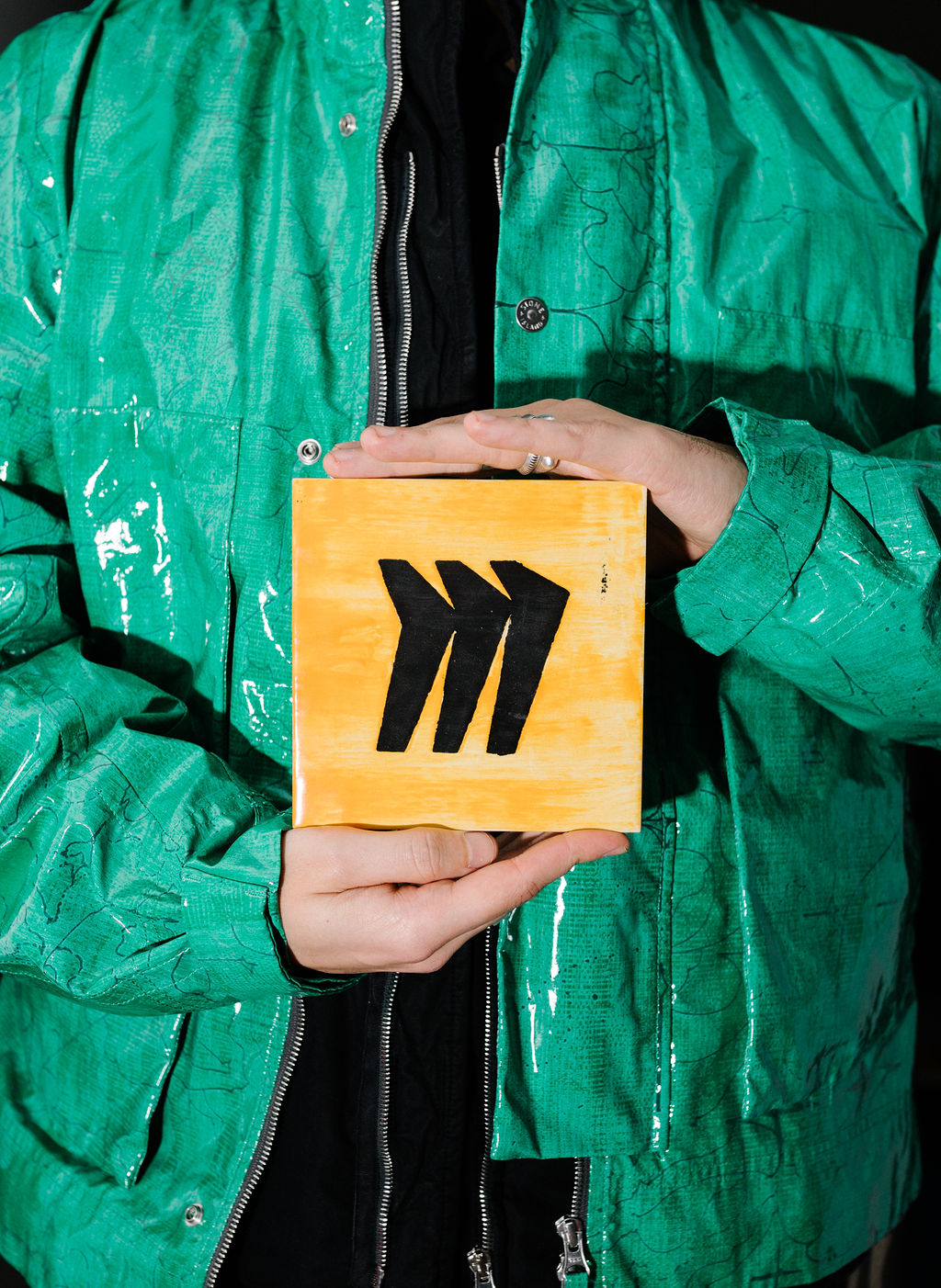
The new Miro brand is now three years old. How did the brand mature over time?
I think maturation is a very natural process for any dynamic system, but it takes effort and intentionality to bring us to the place we wanna be.
We started small, with a limited amount of mediums, formats and channels. We scaled it up. As a design team, we played around and tried things while reflecting on what works and what not.
If I had to pinpoint the nature of the change: I would say Miro's brand is more refined and articulated these days. That's the direct result of hours of team conversations, explorations and experimentation all combined.
The more you work with the intangibility of a substance like brand expression, the sharper they get over time. Noise filters out, yet the signal amplifies its clarity.
From products to landing pages and marketing assets, everything is recognisable and well-implemented. How did you manage to ensure that Miro is consistent in its various assets?
That's a team sport. I'm proud of all the amazing designers, producers, researchers, copywriters, developers, and managers who work together to co-create that holistic experience for all our users.
We strive for a transparent work process through shared communication channels, ways of working, and design reviews. We discuss principles, goals, metrics, learnings, results — everything that matters. By understanding the bigger picture, each and every individual is better supported to make an informed decision. That helps us to align around first principles and execute the work at scale.
Another cornerstone of our design practice is a feedback culture. We do have opinions on design, and we share them openly and respectfully with each other. We call things out. Because we care.
Miro grew from 50+ people to almost 2,000 people within four years. We know the in-house design team is important to Miro. What's it like to be Head of Design in a company that's in a state of hyper growth?
It's a constant cycle of (un)learning, evolving, and iterating.
I joined a company of 50+ people back in 2017, and today that's the size of my team.
I had the privilege to start working with just two multidisciplinary designers and later shape several disciplines within the company: product design, content design, digital design, and user research.
I started by advocating for the practice and leading by example. I took leadership over some strategic initiatives (e.g. MindMap, Accessibility, or the first version of the Platform) to demonstrate how design can influence the overall outcome. I also invested in building a strong rapport with product and engineering peers, alongside helping them to understand how design works and what are the best ways to leverage its potential for the organisational and business challenges.
Once the larger cross-functional team has experienced the tangible value of design across different stages of the product development lifecycle, people tend to appreciate this partnership and develop a taste for good design work. It helped me to first evolve the product design practice from the centralised studio model to an embedded agile cross-functional team model later on, as well as to introduce UX research, Content Design, and Digital Design, alongside Product Design and later establish the design leadership team to accelerate excellence.
Two other evergreen areas while you are in hyper-growth are hiring and team development.
As Head of Design, it's essential to be forward-thinking about the shape and form of the organisation you are building. When do you hire from the market for a specific skill vs coaching someone internally? Who's interested in growing as an IC vs Manager? What are the skills required for achieving a certain grade or being promoted? How do we plan to set up new teams and allocate resources in 3-6-12 months from now, given our exciting knowledge? What processes should we evolve and redesign to accelerate the delivery speed? A lot of very practical, and to some extent less "creative" things to do.
I share the sentiment that design executives should speak business language fluidly while deeply caring about the craft. Your C-suite might not be aware of the aesthetics-usability effect or methodologies for (in)validating your product (design) decisions, and that's ok. Help them to understand the value of these concepts or practices in connection with their business realms: OKRs, KPIs, and core product metrics. It's not that complicated when you are coming from the perspective of organisational goals and targets that are discipline-agnostic — which helps to drive shared understanding across the board.
At some point, you narrow down your focus as a leader to just a few things: business goals, product strategy, your team, processes and the overall quality of the work. Those are the things you can influence directly to drive impact.
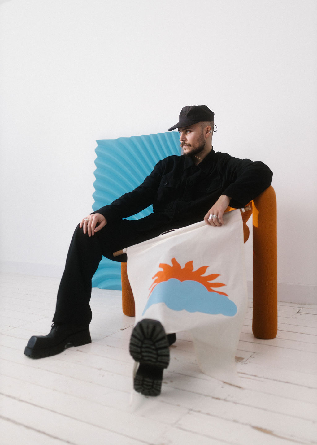
Verve’s design philosophy is all about creating Living Brands. In short: Brands that are modular, holistic, scalable, human and future proof. How do you think the Miro brand lives up to this philosophy?
Working on Miro's new brand, to me, the key goal as Head of Design was to ensure we are developing a bold, modern and flexible visual language that we can use at scale.
Which I think we managed to achieve.
In the chaotic and over-flooded landscape of expressive visual graphics, random illustrations of faceless human bodies, and dorky corporate fonts, sometimes the place of meaning is abolished. Everything looks the same, and it's hard to get the story behind it.
With Miro, each letter represents the "character" — a specific graphic pattern — that behaves in a certain way and creates the guideline and the narrative for its existence within the brand system. It makes things playful and fluid yet rational.
In your reflection on 2020 as a Design Lead you mentioned this year was about being more human. How do you look back on 2022 as the first real post covid lockdown year?
I think that's the toughest year for me as a person and as a leader. I never thought I would have to support my team during wartime. Literally.
I believe leading with empathy at scale is a big topic yet to be uncovered.
It also inspired me to run my personal research about emerging queer influence over post-pandemic leadership in tech, which resulted in a framework and a game I plan to share with the world later this year. Stay tuned.
Can you share something about Around and Miro? Will Around be placed in the Miro brand architecture?
We definitely have a lot of plans, and we are truly honoured to have Around as a part of the Miro family. The only thing I can share is that we are innovating, keeping the real stories and needs of our users and customers in mind.
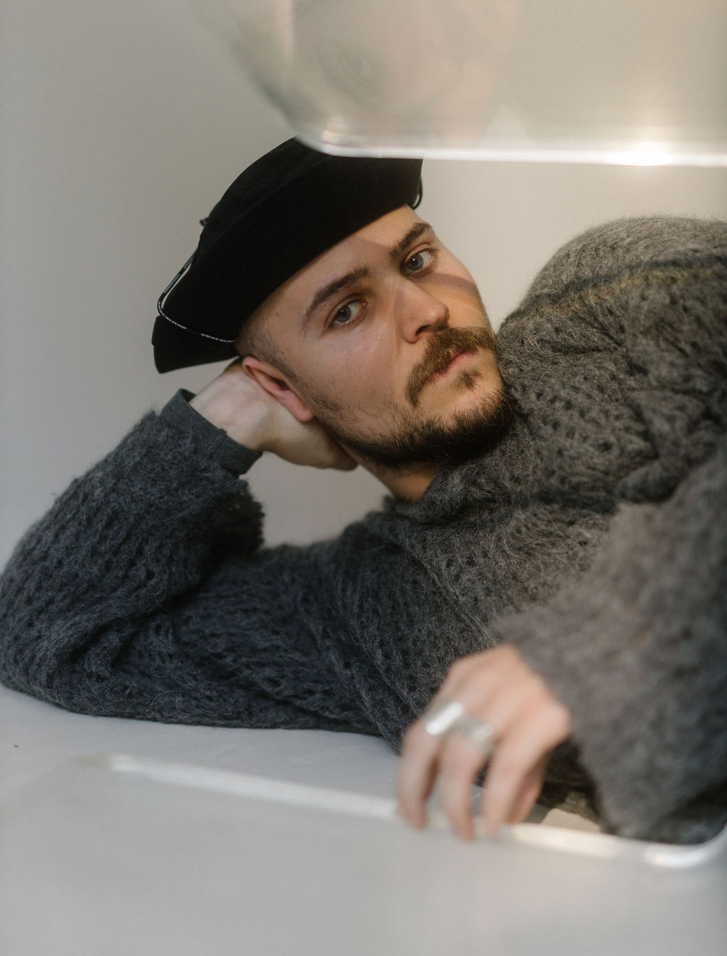
What distinctive brand assets make the most impact?
I think the dichotomy of Brand vs Product is coming to an end in the SaaS world. Your product is your key brand asset. It's not binary anymore — let's embrace the fluid nature of branded experiences, and enjoy the full spectrum of possibilities within the visual and product expressions.
Companies who prioritise the holistic experience across all the touchpoints win the market.
What would you do differently if you could do the rebranding process over again?
Get your priorities, decision making mechanism, and success criteria clear as early as possible.
We had roughly two-three months for renaming, rebranding, design, development, the roll-out, as well as a roadshow reveal at SXSW at Texas. It was quite a tight timeline as you can tell, especially for a business that is running for 8 years, and has hundreds of touchpoints with their clients. I think we didn’t realise initially how massive the shift is, and how many assets and properties we have to modify. But we started mapping these things out, assigning priorities, identifying dependencies and accountable people for different parts of the system, to schedule gradual roll-out to help us meet the ambitious deadline.
Another mission-critical component for rebranding is your success criteria and how you make a final call. I believe that each rebranding is unique. Yet the universal truth is to define the goal and be radically honest with yourself: why are you doing what you’re doing, and what are you trying to achieve? How do we make a decision if the team is not aligned? Whatever the goal is — be clear and outspoken about it from the get-go, and measure yourself against that continuously.
“The universal truth is to define the goal and be radically honest with yourself: why are you doing what you’re doing, and what are you trying to achieve?”
